As I’ve been working on this quilt, I’ve had a little concern that the fabrics are all reading too dark or medium, with not enough lights. So I’ve been consciously adding some lighter fabrics to provide the contrast that I want.
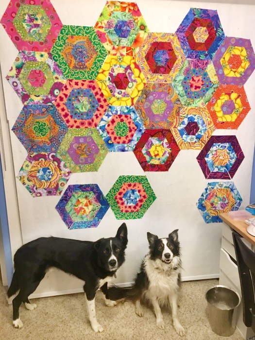
Here’s Rico (with the ear) and Bender posing in front of my new quilt.

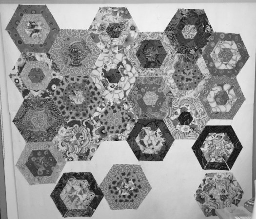
To get a good look at the contrast in a quilt I’ll typically take a photo and adjust it to black and white. Then you can really see the darks and lights.


I feel like I’m close in the lights that I want. I’ve put together some combos for more blocks that should read lighter.
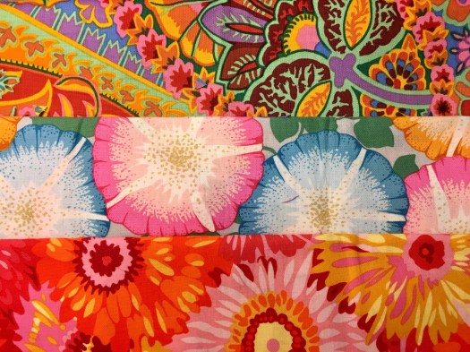
Good lord… these fabrics are so amazing!


There are four blocks where the triangles need to be sewn into hexagons. Then eight more complete blocks cut and sewn, and I’ll throw them all on the design wall and start playing!
