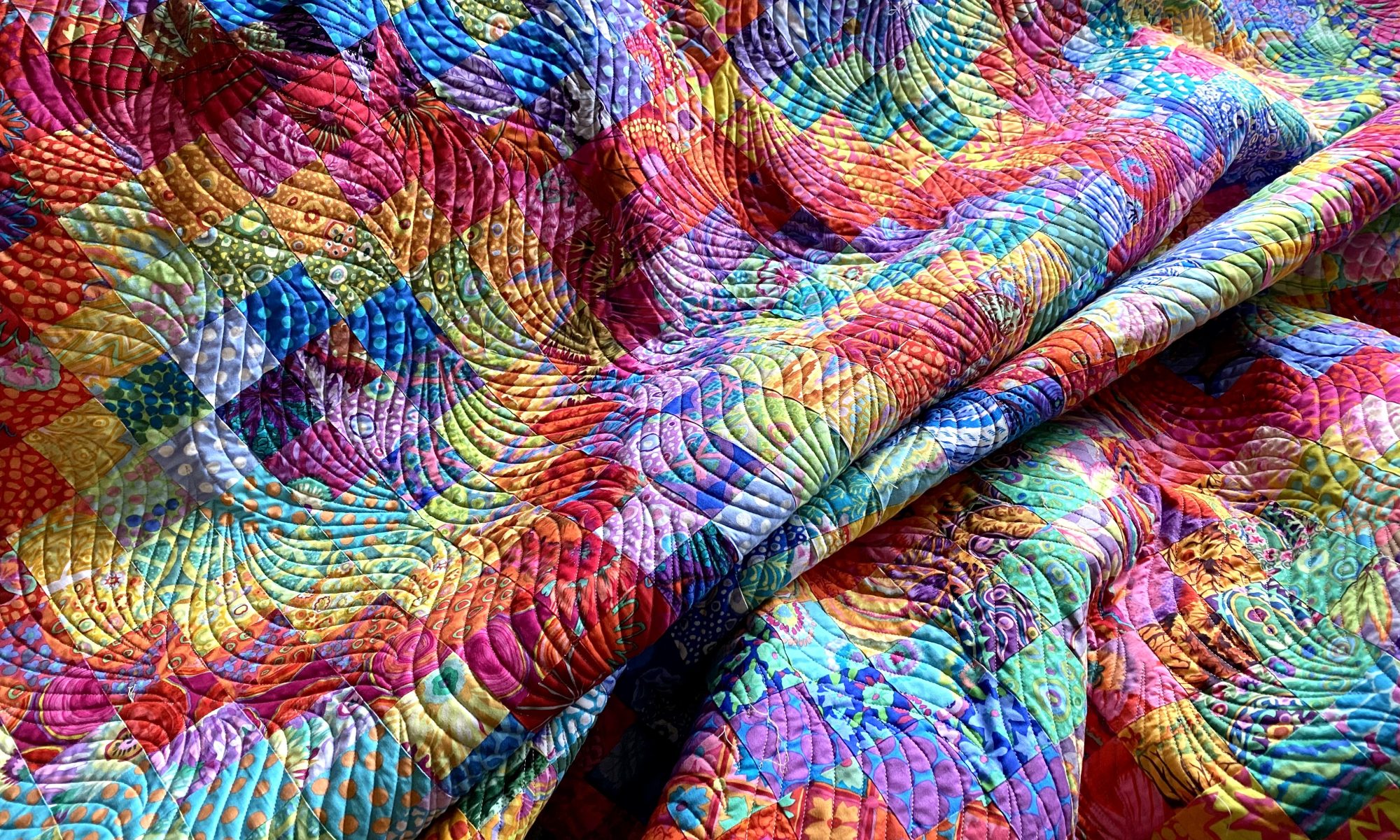
I’m still not quite ready to get into my sewing room and fire things up. I think I’m hesitating a little because I have many backings that need to be made. I’m not looking forward to manipulating and handling all that yardage. So I think I’m procrastinating a little.
But I did spend a few minutes in my sewing room tonight auditioning some potential backings for my Jumble Starburst quilt. I had a particular piece of fabric in mind for it, but I’m not sure it’s really the best option.
I have four options. If you’re inclined, let me know in a comment which one you like and tell me why you like it. It’s fun to see what others like and learn why a particular option works for them.
Here’s option number 1 — Kaffe Layered Stripe in red.

A closer look…

Option number 2 — Kaffe Heraldic Sheilds in green

A closer look…

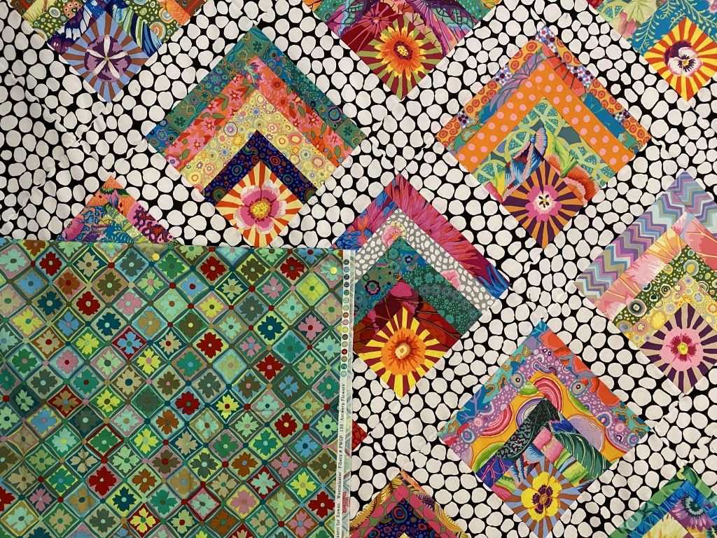
Option number 3 — Kaffe’s Antwerp Flowers in green

A closer look…
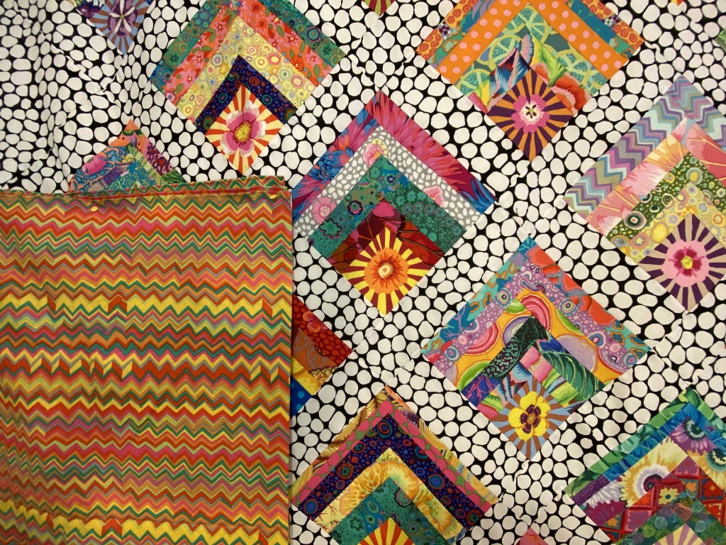
Option number 4 — Brandon Mably’s zig zag in the bright color way

A closer look…
Let me know which one you would choose and why by leaving a comment.
Like I said, the one I had planned to use isn’t really working for me. There are two other options I like. One I don’t like so much. It will be interesting to see how my opinions jive with others.
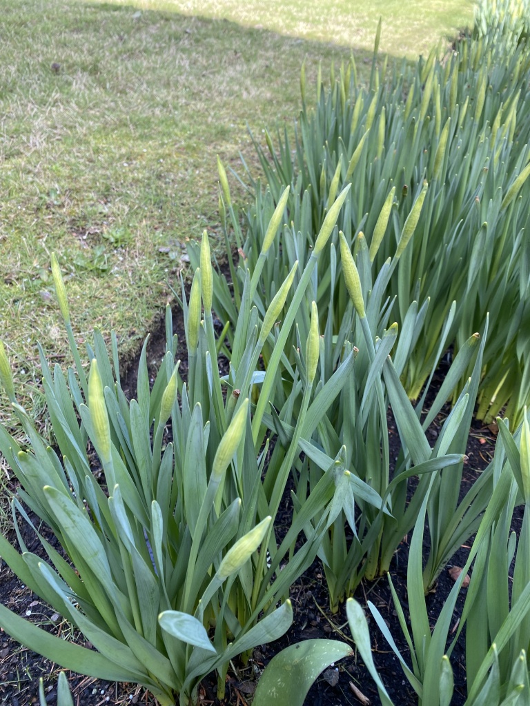
It was a beautiful spring day today. It was in the high 40s and we had a good deal of sunshine throughout the day. I did a short walk around my yard this afternoon to see how spring is progressing.
My daffodils have bulbs that are forming quickly. Won’t be long until these start opening up.
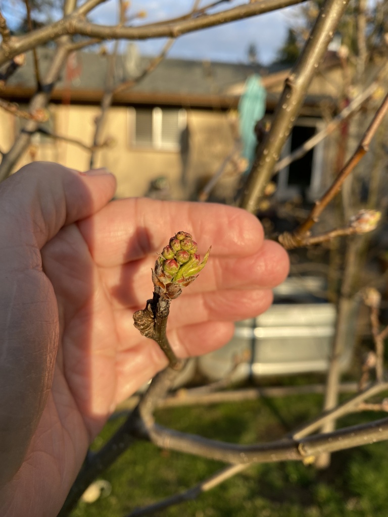
My flowering pear trees (I’ve planted 11 of these in my yard!!!) are forming buds nicely. They will be blooming soon.
The blooms on my forsythia are just starting to open.

For my mother, the forsythia was her indication that spring had arrived. We have many family Easter photos posed in front of the forsythia bush!
I’m already loving the light in the evenings. Look how pretty it was tonight!
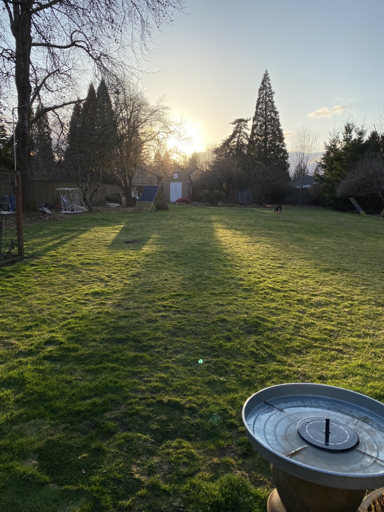
The lawn has just started growing in the last few days. It seems that everything is convinced that spring is really here!

Option 1 provides a lovely contrast while incorporating the quilt’s colors. Second place is Option 4 for the same reason.
LikeLike
I like option #4. I like the color combination. 🙂
LikeLike
Antwerp
LikeLike
It’s #1 for me! Most all the colors of the patchwork are contained in that piece of fabric. I think the red makes the top pop!
Some of the other fabrics make the top look washed out.
LikeLike
The green. Those squares just seem to settle down and blend in.
LikeLike
Hi, I like 3 and 4 possibly going more for 4. This will be an awsome quilt whatever you choose.
LikeLike
It’s Antwerp for me too. I agree with Petronella’s reasoning. A couple of the others are a little distracting. I didn’t care for #2 at all.
LikeLike
Hi, I vote for the red backing for the Jumble quilt because I think it matches best and brings out the bright colors better. Can’t wait to see what you make next!
LikeLike
I prefer your first choice, that’s mostly red. It just gives a bold contrast
As an alternative, consider buying some wide back fabrics, give yourself a break and skip manipulating all that yardage
My local fabric store started carrying some beautiful batiks in 108” and now life is good
LikeLike
I especially like the zig zag fabric with your quilt top because it brings forward your star burst blocks. I have really enjoyed your posts. Thank you for sharing.
LikeLike
My vote would be for #4. The yellow really blends well with the quilt top and brings out the vibrance of it.
LikeLike
Morning! Loving all the spring blooms, we’re in full bloom here in SC, Azaleas are open everywhere which means The Masters Golf Tournament isn’t far behind.
I’m a favorite of Option #4. To me, it repeats every color you have on the front in linear fashion!
LikeLike
The KF stripe in red is my favorite color choice and if you have to piece the backing I think it would go nicely with the B&W jumble as a spacer. I don’t care for #2 at all. #3 is only okay to me and #4 is a definite no. If it were my quilt I think I’d go with one of the KF bold florals or maybe the B&W random dot that has 2” flowers scattered across it. (Sorry I can’t think of that fabric’s name) I also think the KF black millefiori would be stunning. Binding definitely in the B&W jumble so the on point blocks really float. I usually like to frame a quilt with an accent binding, but not this one. So; that’s my two cents worth. I know whatever you choose it will be splendid. Your color sense never fails.
LikeLike
#3 or 4
the green squares echo the top.
LikeLike
Good Morning!
I like #4!
It pulls out the warm colors nicely and there’s also something about the zigzag points that visually tie in with the block points for me. 😁
LikeLike
Definitely Kaffe #1 – it brings out the colors in your beautiful top.
#2-wrong color way. #3-too small print. #4 possible 2nd choice but rather orange. Love your blog.
Denise G.
LikeLike
For me it would be either layered stripe or zigzag. From what I see on my iPad it looks like the tones most reflect those in the quilt especially zigzag. It will be great no matter which one you choose.
LikeLike
I love number 1. KAFFE LAYERED STRIPE. The red makes the whole quilt pop.
LikeLike
Hi
<
div dir=”ltr”>I like #4 the best, colors go nicely without overpowering. The fabric looks like an extensi
LikeLike
Hi Anne, my first choice is #4, my second choice is #3. I don’t see as much green in your quilt with #3. I think #4 warms your whole quilt front up! Just my opinion, because EVERYTHING you make gives me envy as to your eyes for color combinations!
LikeLike
Boy, oh boy …. any of your choices would work but I like option #3 Kaffe Antwerp Garden.
LikeLike
I like Antwerp Flowers, number 3 because it seems to pick up most of the colors in the top.
LikeLike
If it were my quilt, I’d use the zig zag (yellow/ orange). It just looks right. The others are all too dark. Good luck as I’m sure everyone will have a different opinion.
LikeLike
Good morning
<
div>I must say I look forward to your posts and enjoy reading them. I can see why you had a hard time picking the fabric for the backing. I’m like one and three, I know you want only one choice but oh my th
LikeLike
I love option 3 – something about the on-point squares the flowers are in that echos the top. Also I share your feelings about piecing backs, and I wondered if you had tried diagonal piecing them? I haven’t tried it yet, but depending on the size of the quilt you can have one diagonal seam instead of several straight ones, and get the back out of less yardage. I don’t know if long armers like it, but it does also mean the seam isn’t in one place all down the quilt. If you fancy trying it here’s a link to instructions and an online calculator: https://www.flynnquilt.com/free-lessons.htm
Good luck!
LikeLike
I love them all but #4 is my favorite, as the yellows and orange really feel as though there is continuity with the movement of your quilt top. Love your blog, read them all.
LikeLike
I like the layered stripe in red the best. It pulls most of the colors from the front blocks. For me the bright color is the best for the back. It seems to brighten the whole quilt.
LikeLike
The ZigZag- it jumped right out as most complementary to the front. Yes, as others have noted it brings out the orange but I find that helps the jumble recede. My second choice is the Antwerp Green. Just depends on which “feel” you prefer😉.
LikeLike
I feel like the oddball but i like the Heraldic Shield. The color feels like spring, and it doesn’t compete with the front. It is calming yet surprising. Love following you. When i see your posts in my email I always read yours first!! Love from Port St. Lucie, FL.
LikeLike
First – love the quilt!!! I liked #1 & #3. Love the red in 1 and the green with bright colors in 3 works as well.
Whatever you choose will work!!!
LikeLike
I like #1 best, but #4 a close second, but only if #4 is used
LikeLike
I’d go to a fabric store with the top and look for other choices. I love the red color of number 1 but it’s pretty heavy and saturated.
LikeLike
I would choose the first one because it picks up lots of color of the quilt and the size of the print is good. The green is too light, the other green the print is too small. The orange i find the color perfect but the size of the print is too small. Continue your good work. Love you dogs.
LikeLike
My first choice is #1. I love how the red bars pick up the logs. Even the bits of green pick up the green bits on front. Very bold choice.
Second choice would be #4. The yellow and gold zig zag pick up the softer colors on the top. It seems a safer choice than #1 but still with energy.
Third choice #3. It’s calmer. But don’t really like that it is on point like the quilt. Too matchy matchy.
#2… Just no!
Who hoo on the daffodils and green grass.
LikeLike
The red stripe
LikeLike
I like option 4
LikeLike
I would pick #3, Antwerp flowers in green. Partly it echoes the blocks on point on the front, but mainly because I like the color!
LikeLike
After scrolling up and down a few times, I’ve settled on the Antwerp flowers. It happens to be my favorite palette of softened green overall, which is not really relevant to anyone else’s decision, but I also see it as echoing the on-point setting of the face blocks, while supplying a neat contrast in scale. This is a large quilt, so I would enjoy having the smaller print to work with on a bed, as an alternate look. I might even make a sham or pillow covers of the Antwerp.
LikeLike
Yes 💕👍
LikeLike
I would have picked a softer colorway myself but with your choices I pick #4. I do like #3 also but ….When I look at the quilt picture, I see more pastels than brights. I know it’s a picture and my left eyesight is not too great now but I still see pastels, particularly lavender. I also equate spring with forsythia bushes.
LikeLike
My two cents. Zig-zag has my vote. It just sings to me. The lines echo the block shapes and complements rather than competes with the dynamic starbursts. And the colors? Delicious!! Can’t wait to see your final choice. Whatever, it will be a beautiful quilt.
LikeLike
Option 4 – I love how the colors in the zigzag make the floral centers of the block pop
LikeLike
I like #3, the calm green and little squares blend in, not overpowering. All the hard work you did will stand out out and shine. The other options look like they might be too bold and take away from the star of the show which is all that gorgeous work you put in 🤗.
Spring is here! I love all your flower buds💕
🥰 hugs to Rico and Bender 🥰
LikeLike
Heraldic shild in green. I love the lime color with your blocks.
LikeLike
Layered strip would give the most contrast. Herald, not enough contrast, nothing to really connect it. Antwerp is beautiful, I might save that for something else. It’s the deep green that doesn’t work for me, cool for this quilt which I think need something warm. I like Zig-Zag! golden colors kind of echo the colors in the log cabin blocks. The way the line are work with the on point blocks. Also I think the zig zag has been the thought process of getting this quilt assembled, 😂 Back and forth with the how to get it together. This is only MHO.
LikeLiked by 1 person
I really like option 3. Antwerp has so many of the colors from your quilt top without being overbearing in one color or another. I like that the squares on both sides are diagonal – it pulls it together without being matchy-matchy. It also has a soothing, easy feeling that makes you want to wrap up in it.
LikeLike
Option #4! I like the colors that pull from the top to the backing. Also, the zigzag shape is repeated from the zigzag of the rows of blocks on the front.
I usually fold the top over so the backing fabric is about the same in amount showing. My bed quilts, when in use, seldom show just one side up!
LikeLike
I am really drawn to the Red Layered Stripe in the first photos! I love the bold contrast which draws out the reds and brights on the front, even though you won’t necessarily “see” the backing. Personally I love when the back of a quilt is nearly as visually interesting as the front, I feel like so many quilters treat the back as a throw away decision. That said, I hear you with the whole reluctance to piece that large backing, sometimes you just gotta do it!
LikeLike
I like the green—–green is a neutral; it ties every color together. I love your work. Thanks for sharing
LikeLike
I like option 4
LikeLike
I like option 4, although 3 (surprisingly, since I’m not a big fan of green) looks nice, too. The size of the print pattern and the fact that it’s predominately orange and it has all if the top colors in it are what appeal to me.
LikeLike