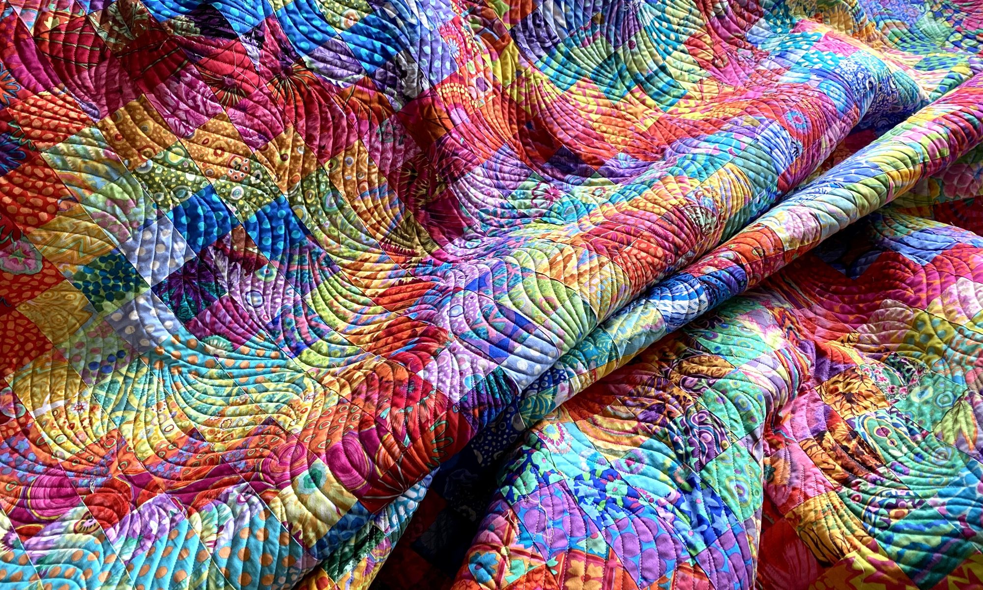
I’m still not quite ready to get into my sewing room and fire things up. I think I’m hesitating a little because I have many backings that need to be made. I’m not looking forward to manipulating and handling all that yardage. So I think I’m procrastinating a little.
But I did spend a few minutes in my sewing room tonight auditioning some potential backings for my Jumble Starburst quilt. I had a particular piece of fabric in mind for it, but I’m not sure it’s really the best option.
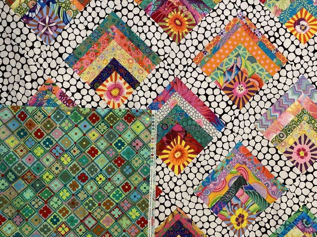
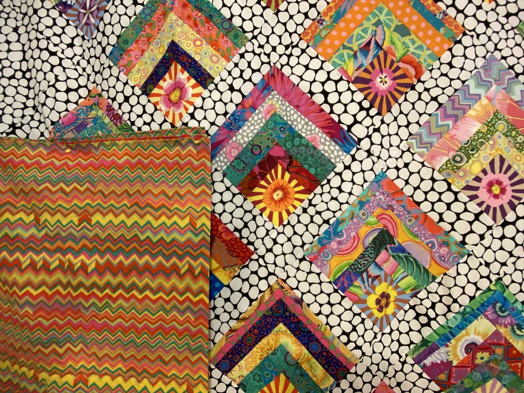
I have four options. If you’re inclined, let me know in a comment which one you like and tell me why you like it. It’s fun to see what others like and learn why a particular option works for them.
Here’s option number 1 — Kaffe Layered Stripe in red.

A closer look…

Option number 2 — Kaffe Heraldic Sheilds in green

A closer look…

Option number 3 — Kaffe’s Antwerp Flowers in green

A closer look…
Option number 4 — Brandon Mably’s zig zag in the bright color way

A closer look…
Let me know which one you would choose and why by leaving a comment.
Like I said, the one I had planned to use isn’t really working for me. There are two other options I like. One I don’t like so much. It will be interesting to see how my opinions jive with others.
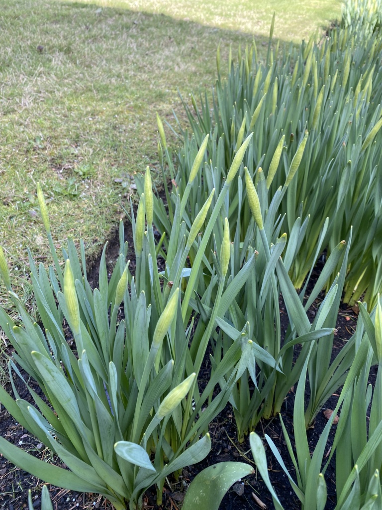
It was a beautiful spring day today. It was in the high 40s and we had a good deal of sunshine throughout the day. I did a short walk around my yard this afternoon to see how spring is progressing.
My daffodils have bulbs that are forming quickly. Won’t be long until these start opening up.
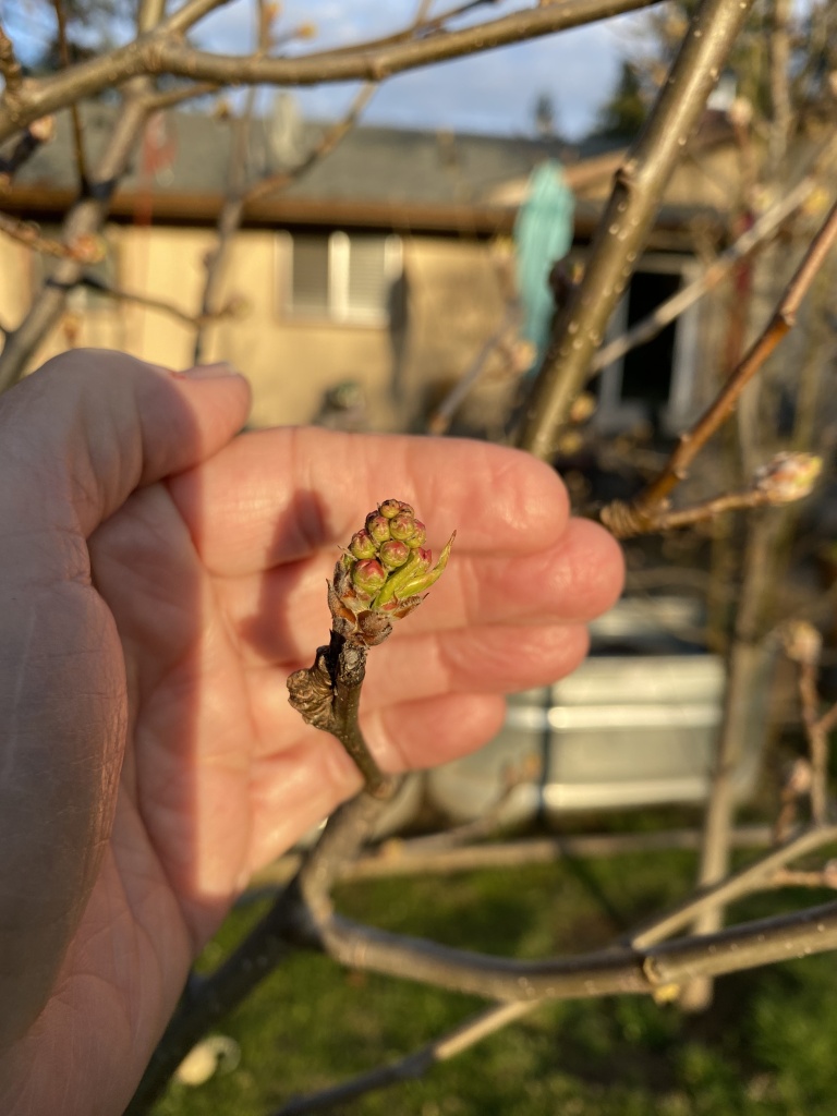
My flowering pear trees (I’ve planted 11 of these in my yard!!!) are forming buds nicely. They will be blooming soon.
The blooms on my forsythia are just starting to open.

For my mother, the forsythia was her indication that spring had arrived. We have many family Easter photos posed in front of the forsythia bush!
I’m already loving the light in the evenings. Look how pretty it was tonight!
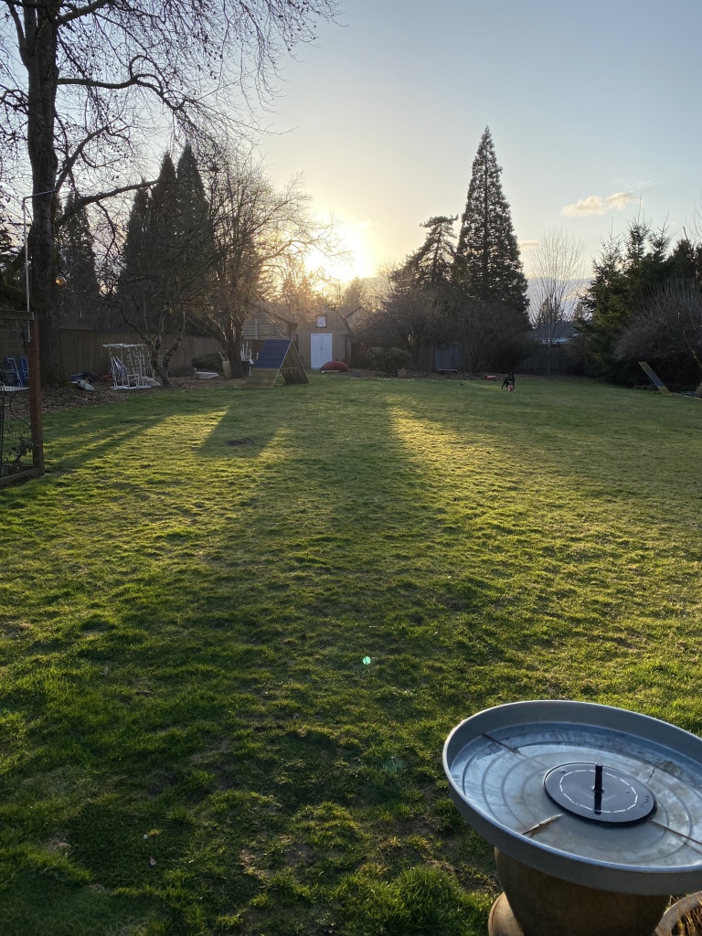
The lawn has just started growing in the last few days. It seems that everything is convinced that spring is really here!

I kinda like 4 best, seems to pop the colors in the quilt the most, just my opinion. The quilt is gorgeous, I love it. Kiss the boys for me.
LikeLike
For me it’s gotta be option 2, the heraldic shields. First, the color seems perfect! Then it’s a combination of three things: the shield shapes are somewhat similar to the Starburst blocks, they’re orientated the same and finally, the stripes on the shields reflect the Starburst stripes.
LikeLike
The gold colored fabric.
LikeLike
#4 coordinates so well that if a portion of the quilt is turned down it will look as though they belong together.
LikeLike
Option #3 🙂
LikeLike
1 & 4 fabrics i love, Yet Red 1 wins for my vote – size of design being larger makes it for me as well. I live in WA Cascades & love this change, yet lived & raised kiddos in OR & adored the explosion of spring plantings & trees. Delighted to see your daffy progress & Pear blossoms developing. Enjoy your dawg pals & adventures:)
ardine
LikeLike
#3, the smaller print does not distract from the beautiful front.
LikeLike
Option #4 The scale works the colors don’t fight with the front. I like it. That said, I have a top that is calling for #2. I may have to see if I can find some.
LikeLike
I really don’t like any of these choices. I think I would prefer a bold flower backing. Something entirely opposite of the front. Would make quilt entirely reversible, from a real planed design to a jumble of summer flowers. Just my unprofessional opinion!🤗
LikeLike
#4 Starburst looks like a SUNBURST to me. The zig—zag pattern reminds me of the suns rays. I think it will be a very appropriate backing.
LikeLike
#4 – just looks right
LikeLike
I love number 1 because it is so bold and makes me laugh. I love number 3 because it is a bit yin and yang. So out there then so demure which comes as a surprise. Hmmmm!
LikeLike
First, I Love your pattern and choice of fabrics chosen.
LikeLike
I just tried to search “Jumb
LikeLike
I love the first two backgrounds, The red is very sparky with the rde on the front andmakes you really notice it. The soft greens makes thetop seem gentler and more calming. So it depends on your mood for it. Can’t stand the last two. They are too busy for the top and don’t blend with it. Love your work and love your life. Enjoy and prosper! Linda
LikeLike
I’m going for the zig zag – number 4! Love all colours in this design from Brandon. I love fabric number 1 but then though perhaps too bright and didn’t bring in the feel of the quilt top.
LikeLike
I think that Brandon’s orange flower fabric would look best as the backing for this quilt.
LikeLike
like the first one
LikeLike
I can see why you’re struggling. I’ve changed my mind three times already. Every one of them is a viable option. It’s hard to know just by a photo, but I’m leaning towards option 1 because it’s unique/colorful and I like quilt backs to be as fun as the front (and maybe because red is one of my favorite colors) AND option 4 which originally I didn’t choose, but it just seems to play well with the colors on the front and doesn’t detract from them.
LikeLike
I definitely like for the back of my quilt to function as well as the front so that I can switch them up from time to time. Therefor, I vote for #1. Can’t wait to hear what you choose. Give those handsome boys of yours a little scratch behind the ears for me.
LikeLike
#3 Antwerp Flowers
LikeLike
I like Option 4, the bright zig zag. It picks up the brightness in the center of your log cabin blocks.
LikeLike
I vote for #4. I pick with my gut feeling & that was the only one I liked.
LikeLike
#3 looks the best to me as it carries out the overall shapes and tones of the blocks on the front
LikeLike
Option number 3 — Kaffe’s Antwerp Flowers in green. These mimic the squares on point on the front of the quilt and pick up the colors from the front of the quilt. I vote for Option #3
Have a great weekend, Anne
LikeLike
I like option 3, the little squares will mimic the big squares on the front. Donna M.
Sent from Mailhttps://go.microsoft.com/fwlink/?LinkId=550986 for Windows
LikeLike
I love your colorful quilt with the black and white jumble. For the back, how would you feel about a black and white fabric… I am thinking of the onion skin fabric. Would that work? Hmmmmm.. Or maybe a predominantly black fabric with white daisies or designs through it. Jut food for thought! Beautiful quilt top!!
LikeLiked by 1 person
I have a piece of onion rings that I bought with a backing in mind. But I feel like that’s too much black and white. I really feel like this needs a saturated and colorful backing.
Anne
LikeLike
I don’t like any of them. Just too busy and does not compliment the quilt top. My suggestion would be to use the same black and white jumble as the sashing and use the #4 zigzag for the binding.
LikeLiked by 1 person
I have a piece of Onion rings that I thought about, but I think it needs color. To put more black and white not the back feels so blah to me.
Anne
LikeLike
Personal choice I suppose but
Maybe a pieced backing using strips of jumble or onion rings with #4 zigzag to break it up. Use a solid fabric for the binding.
I know that you will make a choice that makes you happy. Can’t wait to see what you choose.
LikeLiked by 1 person
I would choose No. 3, because they mimic the pattern in the front. The first ones are to wild for me, because the pattern in front is already very busy. I´ve been reading your posts for a while and I really enjoy them. And I love your dogs. Thank you for sharing.
Andrea from Germany
LikeLiked by 1 person
I just saw this. Backing Option 1/2 with the wonderful AFRICAN DESIGN–beautiful in itself–is my favorite.
LikeLike
Oh, that ship sailed weeks ago! I’ve already purchased a different fabric for the backing!
Anne
LikeLike