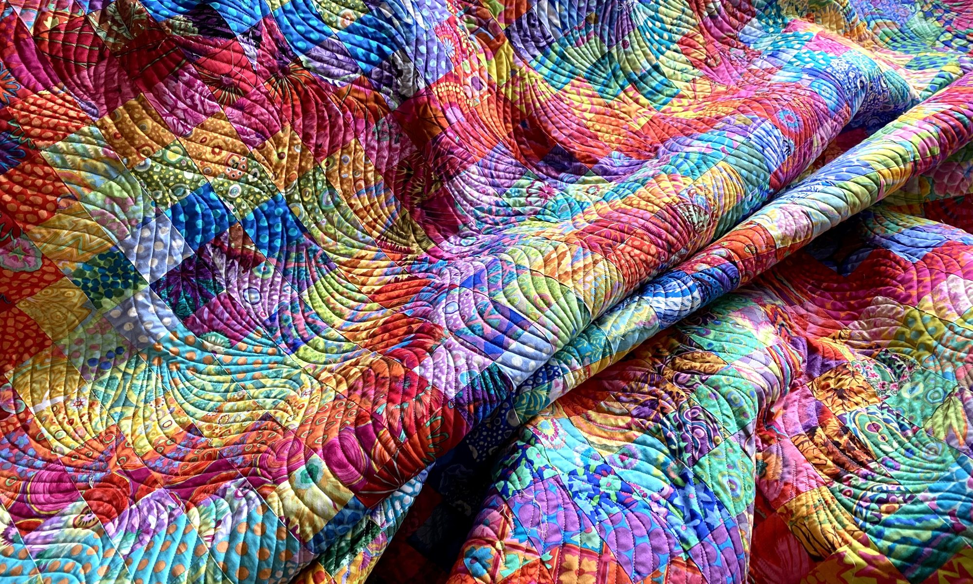
I’m still not quite ready to get into my sewing room and fire things up. I think I’m hesitating a little because I have many backings that need to be made. I’m not looking forward to manipulating and handling all that yardage. So I think I’m procrastinating a little.
But I did spend a few minutes in my sewing room tonight auditioning some potential backings for my Jumble Starburst quilt. I had a particular piece of fabric in mind for it, but I’m not sure it’s really the best option.
I have four options. If you’re inclined, let me know in a comment which one you like and tell me why you like it. It’s fun to see what others like and learn why a particular option works for them.
Here’s option number 1 — Kaffe Layered Stripe in red.

A closer look…

Option number 2 — Kaffe Heraldic Sheilds in green

A closer look…

Option number 3 — Kaffe’s Antwerp Flowers in green

A closer look…
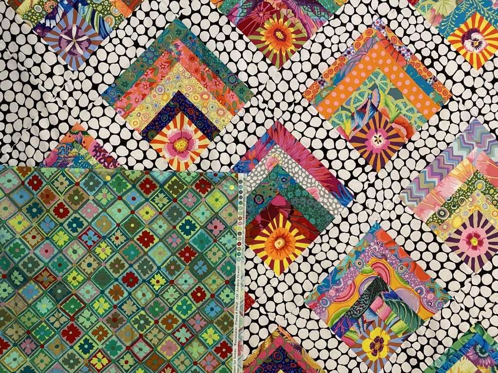
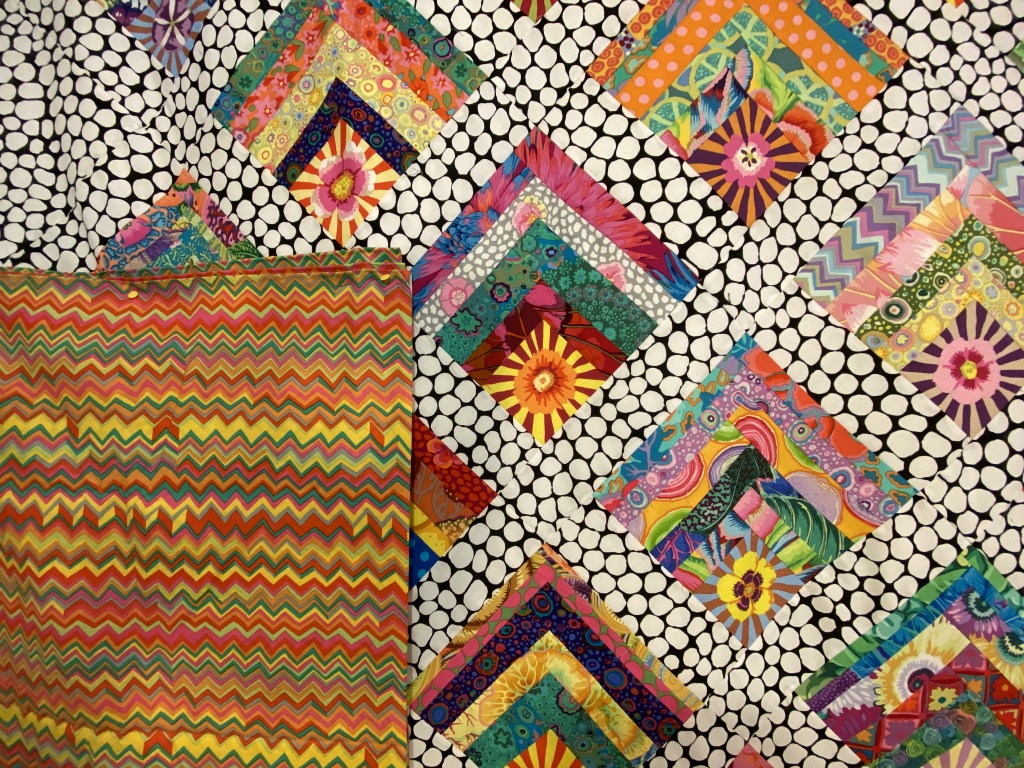
Option number 4 — Brandon Mably’s zig zag in the bright color way

A closer look…
Let me know which one you would choose and why by leaving a comment.
Like I said, the one I had planned to use isn’t really working for me. There are two other options I like. One I don’t like so much. It will be interesting to see how my opinions jive with others.
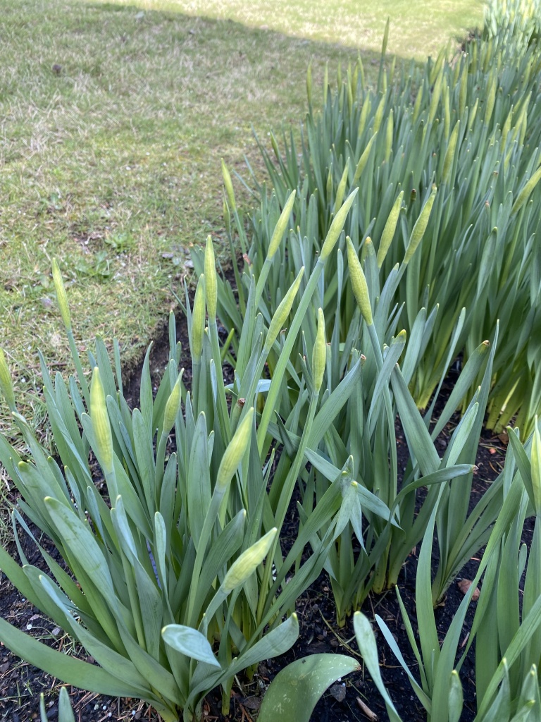
It was a beautiful spring day today. It was in the high 40s and we had a good deal of sunshine throughout the day. I did a short walk around my yard this afternoon to see how spring is progressing.
My daffodils have bulbs that are forming quickly. Won’t be long until these start opening up.
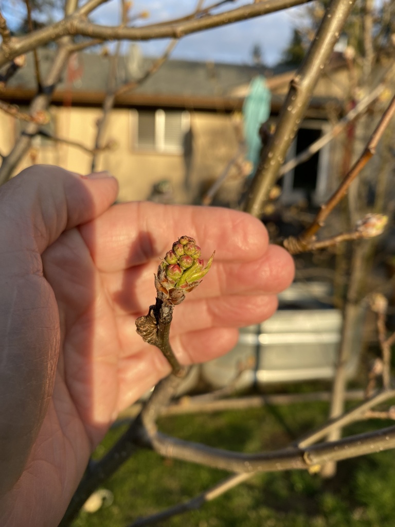
My flowering pear trees (I’ve planted 11 of these in my yard!!!) are forming buds nicely. They will be blooming soon.
The blooms on my forsythia are just starting to open.

For my mother, the forsythia was her indication that spring had arrived. We have many family Easter photos posed in front of the forsythia bush!
I’m already loving the light in the evenings. Look how pretty it was tonight!
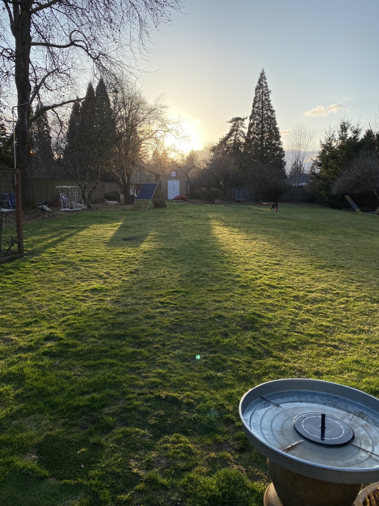
The lawn has just started growing in the last few days. It seems that everything is convinced that spring is really here!

Happy Spring! Backing choices: my favorite is Option 2-the Heraldic Shields in green. It echoes many of the colors in the blocks and really has the light, bright “feel” reflected in the quilt top. Option 1 seems almost competitive with the block fabrics, Option 3 is nice but a little dark in my eyes, and Option 4 is a great fabric but doesn’t strike the same chord as Option 2. So there you have it. But I’m thinking this is going to be a wonderful quilt with any of the backing fabrics. Oh yes, and then there is binding! Yet another consideration. We’ll await your decision.
LikeLike
re Diagonal pieced backing, I just found a more sophisticated calculator from Jinney Beyer, it works online or you can print it out and fill in the numbers and get your calculator out! https://jinnybeyer.com/wp-content/uploads/2017/01/Diagonal-Backing-Worksheet.pdf
I played around with a few quilt sizes from my patterns, and it varies widely whether this saves fabric – a baby size saved one yard of fabric, but a throw size took exactly the same amount. It apparently only saves fabric if your quilt back is up to 1.5 x the width of your backing fabric, so with standard 42″ wide quilting fabric that will be longarmed, that means a quilt up to 53″ wide – smaller than most of yours I think!
LikeLike
I really like the layered stripe in red!
LikeLike
Red for me, but I would always choose red.
LikeLike
I like option one because it covers all the colors in the quilt, it’s bright and happy.
Sent from my iPad
>
LikeLike
Can’t decided between 3 and 4. I love them both. I would just have to live with them for a while to decide. Good luck.
LikeLike
My first choice is #4. I think it brings out the golds and yellows in the quilt.
LikeLike
I favor #3 , the flowers mimic the flowers on front, like a smaller version, very nice. My second choice would be #4, love the zigzag so much and it picks up the bright yellows from front well. 🥰
LikeLike
I like Option 3 because it has the block like pattern as the front. The color palette is calming in my eyes. I’m sure whatever you decide will be the perfect one.
LikeLike
I like the red the best but not that fabric. The 2 green ones are too anemic. The quilt needs a bolder fabric, so I think the orange striped one is the best.
LikeLike
Though I’m totally a green lover, I’m attracted to both of the warm, crazy options. I guess I’ll get my green fix from looking at your lovely outdoor pics! Here in central MN we are still totally white with naked trees…it will likely be two more months before we get that spring green glow in the woods, any buds of any kind, and the glisten of blue on open water of the lake. For today, more snow predicted 😵💫
LikeLike
Hi! In my opinion, you need a very small pattern for the backing that ‘reads’ more solid, as the top is so wonderful in its many colors. The last 2 go in that direction, but personally I’d do a jumble in another color.
This quilt has kinda burned you out. Why not finish a different quilt for now? Happy sewing ! Laura McCabe
LikeLike
I really like selection 1 or 3, not fond of 2. I just wanted to say that I have been following you for a long time, and I so enjoy your posts, and look forward to them. I just had my 65th birthday and will retire from a very stressful job as of March 31, and am looking forward to putting a dent in my stash that I haven’t had the time to use in all the years that I have been buying. Sounds like so many of us, right. Just wanted to say thanks for sharing. Looking forward to what’s next.
Terri from Minnesota.
PS, Are daffodils are still under a couple of feet of snow. We are expecting another 4 to 7 inches of snow later today, into early morning Friday. My retirement party for work is tomorrow, hope it doesn’t get cancelled because of snow. ________________________________
LikeLike
Option #4. I like the way its colors play with your blocks. #1 would be my second choice only because it doesn’t have enough pops of light contrast to harmonize with the pieced blocks. All that being said, you rarely see both sides together so if one backing is your favorite for a whole cloth quilt (mine would be #2 or #3), I’d use that and make it reversible.
LikeLike
definitely the red – it makes the others POP.
2nd would be the green – a more relaxed look. LOVE what you do.
LikeLike
Hello! I think the multi colored zig zag would be a great choice! It pulls on all those beautiful colors. Can’t wait to see what you do with it!
LikeLike
Hi Anne,
<
div>I think I would go with opti
LikeLike
I’m going w #4, the top is the eye candy in this quilt and the zig-zag kinda mimics it but doesnt overpower. (Red is my fav colour but too much for this one😆)
Love, love, love what you share!
LikeLiked by 1 person
I like option 4 the best as the colors coordinate with the blocks and the zigzags echo the rows of blocks. Thanks for your posts. I enjoy them.
LikeLike
At first it was a toss up between 3 & 4. Three has the same vibe as the top but life’s more interesting when things don’t match but just complement..After all that jabbering I pick 4.
LikeLike
I like the Brandon Mabley zig zag. (Noticed that I’m definitely in the minority!) It made both the yellows and reds in the quilt top pop for me. Also, the top reads as a lighter color quilt and this fabric is on the lighter side.
Like your spring yard pictures. We continue to have below freezing every night and some daytime highs also. Soon it might be mud season, but no sign of any green yet.
LikeLiked by 1 person
I love your work and your blog, and the dogs of course. Since you asked I would say none of those 4 – they are all too busy and fight with the jumble. I would choose a very large print like Kaffee Big Blooms – it would bring out the starburst too. Of the 4 I would choose the shields only because it is a more restful pallet.
Sarah
LikeLike
I like Antwerp Flowers as my number one choice. The front is very bold and the green takes a back seat to all the jumble background. My second choice is the ZigZag as it holds its own with everything going on on the front and the colors coordinate too.
LikeLike
After reading ALL of the comments, guess #4 is not a minority, but still my first choice. 😀
LikeLiked by 1 person
#4
LikeLike
Hands down, #4. The colors and scale of the print are perfect as well as the overall visual feel of the front. It completes the story to my mind. #1 overpowers the front. #2 too pale and #3 meh – seems boring. I react to color in a physical way and #4 is the only one that “felt” right to me.
LikeLike
My 2 cents worth is option #1, Kaffee red stripe. It repeats a lot of the colors and the strips of the blocks on the front. Plus I just love red!
LikeLike
I like number 4, the warm zigzag.
LikeLike
I really like the Brandon Mably bright color wave.
LikeLike
Myp choice would be Choice #1 Kaffee Layered Stripe in Red because it has all of the colours from the front and would not look as busy as some of the other fabrics.
LikeLike
Your quilt turned out beautiful, enough if it did almost make your head explode. I would go with option 2 or 4. Option 2 because it would be totally unexpected when you looked at the back. Option 4 because it pulls the colors out of the quilt top. I totally agree with your mom, forsythia bushes make me think of spring. Daffodils remind me of home, Virginia, I miss the spring bulbs. Too hot in Texas for them.
LikeLike
You are way ahead of us, spring-wise, although I *did* see daffodils blooming in other people’s yards yesterday. Mine seem not to have gotten the spring memo yet.
As for the quilt backing, I like option 2, Heraldic Shields in green, the best. None of the choices are bad, in my view. I picked that second option because as I looked at the overall effect, it seemed to me that the light green echoed the value of the front of the quilt. Because of the extent of the Jumble background, the overall value of the front of the quilt—to my eyes—has a more “subdued” quality than a lot of other tops you have made and displayed on this blog. The light green just seems easy on the eye, aligned with the overall value of the front of the quilt, and it also picks up the same shades of green in the sunburst stars. Ultimately, I think it is a matter of taste, on your part. If you pick the red, that makes the quilt feel a lot more “hot” and energizing to my eyes. But *all* of them are lovely. I am looking forward to seeing what you decide!
LikeLike
#1– just grabs my attention, looks great. Then #4. But honestly, I would take into consideration where the quilt will end up. What might look best in a plain white room, might not look good at all in some situations. I’d try the backing where I planned to use the quilt. If you are not going to ever see the backing, then I think I would pick something less expensive–
LikeLike
Hi I’d pick either the Kaffe red or the Brandon zigzag. Both are in the warm tones that I think compliment the top. The second Heraldic green is totally off in my opinion and the third green is okay, but just okay and since when did you ever do okay? Lolol. I absolutely love this quilt top! Then again I love all your quilts. If you get it done you can play with something new….sigh, I know the feeling. Can’t wait to see what you pick. Thanks for sharing with us!.
LikeLike
Option number 3, Antwerp Flowers appeals to me as the backing for this gorgeous quilt. I like the smaller scale of the print to contrast with the top.
LikeLike
#1 & 4 make the colors in the quilt POP. Love , love your blog, first thing I read every morning !
LikeLike
Your quilttop is very exciting and i really like your pick of no. 4. It has a lot of the colors from the front.
LikeLike
I really like option #3. The green sets the the quilt nicely and the flowers in it mimic the starbursts.
LikeLike
Hi,
You’re braver than I when it comes to quilt backs. I tend to choose blender type fabrics which pick out one or two colours from the quilt top.
Given your chosen options I’d go for the Mably #4.
Good luck!
Lindy
LikeLiked by 1 person
#1 red contrasts nicely with the black spots..the others are to “printy” I think conflicting with the black print which is dominant. Also the red has all the colors in itl.
LikeLike
I love Brandon Mabley’s zigzag. To me, it doesn’t compete or try to replicate the quilt design. It offers the same colors in a more relaxing design than the quilt top.
LikeLiked by 1 person
Love the stripes. So #4 for me. But instead of having the stripes go either horizontal or vertical how about diagonally. Or form a pattern alternating vertical and horizontal such as a 4-patch. I know that’s crazy and more work but possibly more FUN!! And that’s what it’s all about, isn’t it?
LikeLike
For the backing – I like option #3 the best!
LikeLike
You have a great stash! I like zigzag option 4 the best. 3 second best. I feel like 1 and 2 compete w/the flimsie too much and I know how hard you worked on it!!!
LikeLike
First, the back doesn’t “have” to go with the front, as it won’t show. having said that, the front of the quilt is very busy (fabulous but there is a lot going on). I think #3 is better-it reads less busy to me. I planted a forsythia bush in my front yard in memory of my momma. She also loved them.
LikeLike
Wonderful quilt top! I like #1 because the colors pop. I lean toward bright saturated colors. I like #4 because the colors are picked up in the quilt so well! It pops too. I am moving toward #4. The backs are a tough one. You have terrific fabric choices. Good luck!☺️
LikeLike
I like the Antwerp flowers for these reasons.
1. It’s squares on point like the front
2. It’s flowers like the front
3. It will be a ton easier to match the prints when sewing the pieces together since the “lines” are small and It’s busy busy busy.
LikeLike
Congratulations on “coming down the home stretch” to finish your lovely, though challenging quilt! I would go with #1 for the backing. The red and additional vibrant colors are an equal match to the strong color landscape of the front side of the quilt. #4, the green squares, would be my second choice. Numbers 2 & 3 just don’t fit with the quilt top, in my opinion. They both are a slightly yellow green which I think you have to be careful of since it can convey a sort of queasy feeling – a little of that color goes a long way. Plus, I think the shield pattern in number 2 just isn’t a complimentary pattern to the front side. Good luck with your choice!
LikeLike
My choice would be #3 because of the on point setting of the design. It really complements the quilt design.
LikeLike
One of the greens, for sure
Sent from my iPad
<
div dir=”ltr”>
<
blockquote type=”cite”>
LikeLike