I’ve had several people ask me how I’m arranging my colors in my strip sets for my scrappy trip quilt. A couple others have asked for clarification on how I use the metal ruler in pressing my strip sets.
I made a quick video to show you how I use the ruler. But first, here’s a few tips on how I make my strip sets. After I sew two strips together, I finger press the seam allowance. Then I’ll press each set of two strips with the iron. I sew the three sets of two strips into one big set of six strips then finger press the seam allowances on the two new seams. I press the whole six strip set on the ironing board. I press the seam allowances in the direction recommended in Bonnie Hunter’s tutorial. I find that finger pressing has helped me keep my strip sets straighter and makes it easier to press the sets.
Here’s a link to my metal ruler video on Youtube.
Now, about how I’m arranging my colors for the blocks in my scrappy trip. I want red to be the predominant color in the quilt, so I’ve cut more red strips than other colors. Here’s the photo that I shared earlier of my fabric strips for this quilt.
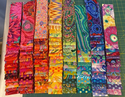
The rows of colors in this photo are basically red, red, orange, yellow, green, turquoise, blue, purple. They’re all in the same order as the colors of the rainbow: Red, orange, yellow, green, blue, indigo, violet. I remember it by remembering Roy G. Biv.
Each strip set starts with one of the darker reds, followed by a lighter red or orange. Then a yellow. The remaining three strips are a combo of green, turquoise, blue and purple. Not all of these last four colors will appear in each block.
Here are some strip sets that I sewed together and pressed tonight.

The colors in each strip set follow the order of the colors in the rainbow.
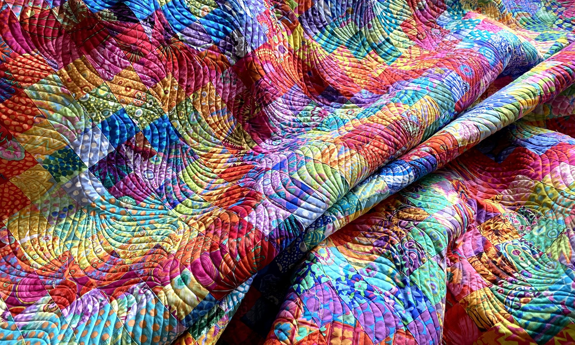
When I’m putting the blocks together I keep the darkest red as the center strips on the diagonal of the block, as in these two blocks.

This is what gives me the strong red diagonal lines across the quilt and forms the shape of the diamonds. I saw one tutorial for this quilt that said the center diagonal should be the strongest fabric in your set of six… either the darkest, lightest, or most vivid pattern.
Of course, you can arrange your colors any way you want. And I have a lot of ideas for different color arrangements I’d like to try.
And speaking of color… LOOK AT THIS!!!

I’ve been collecting gray batiks for some time thinking I’d like to make a monochromatic quilt out of them some day. And now I’m thinking it might be a trip quilt.
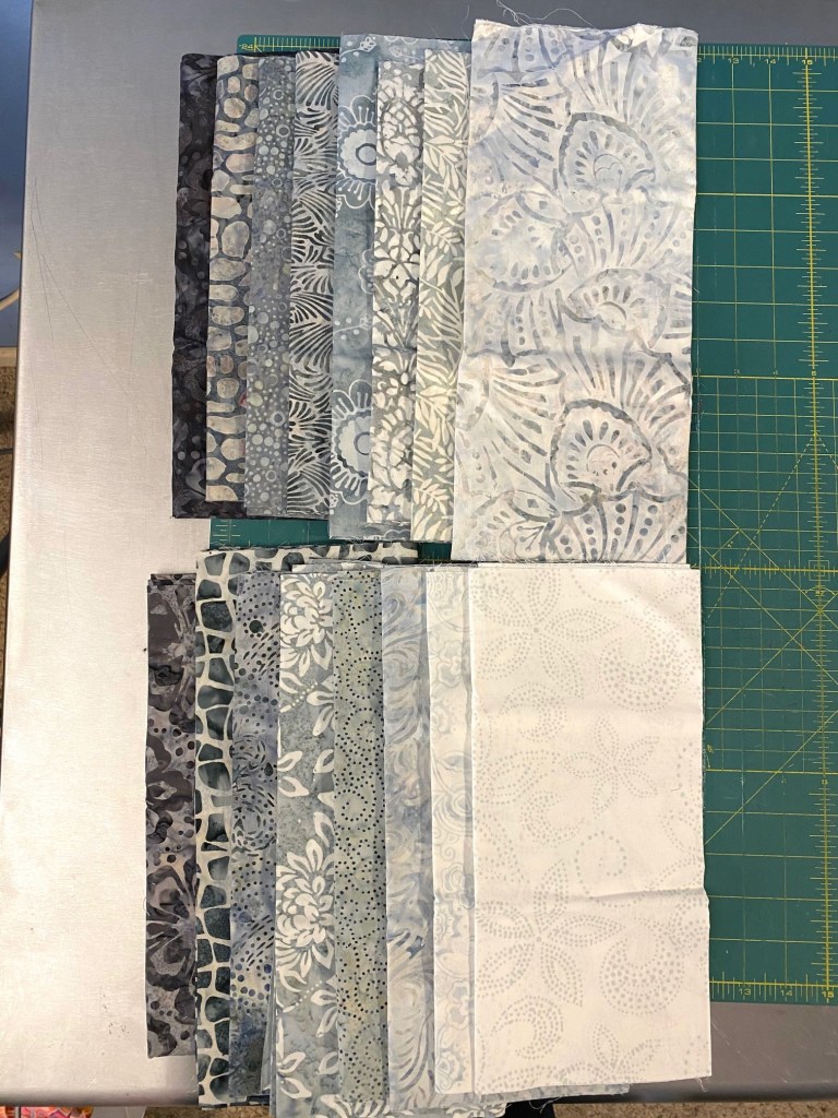
I’ve been looking at lighter and more neutral approaches to the trip quilts and I really like the soft comfy look of them.
But I’m thinking I might add in some light pastel colored batiks to give it a little bit of interest.

I’m going to give this some thought before diving in.

Great colors combining tips!!! Thx!!! Donna
LikeLiked by 1 person
thanks for taking the time to provide feedback!
LikeLike
My eye would prefer the “pops” of color with muted colors.
Beige, taupe, muted greens or blues……
But then I am not a” strong contrast color” person….
LOVE your work!
And how do you find time for ALL you do?
LikeLiked by 1 person
Haha! Yes! I rarely go the beige route! I really do love vibrant color and bold patterns.
How do I find time? I stay up way too late!
LikeLike
The bag is beautiful! The colors are amazing! I’ve been working with batiks usually, but would love to have some kff!
LikeLiked by 1 person
I started out with batiks then started slowly building my stash of KFC fabrics. I’m planning a quilt soon that will include batiks combined with KFC. It should be fun!
Anne
LikeLike
Is there a pattern for the scrappy trip quilt? I have a layercake with different #s of colors and patterns (so not 2 of each print) +some added yardage to use. This gives me hope that I can vary the fabrics and not have same amount of each one.
LikeLike
I linked to it in the blog post you commented on. It’s Bonnie Hunter’s scrappy trip tutorial. You can find it with a Google search.
Anne
LikeLike