I’m still not quite ready to get into my sewing room and fire things up. I think I’m hesitating a little because I have many backings that need to be made. I’m not looking forward to manipulating and handling all that yardage. So I think I’m procrastinating a little.
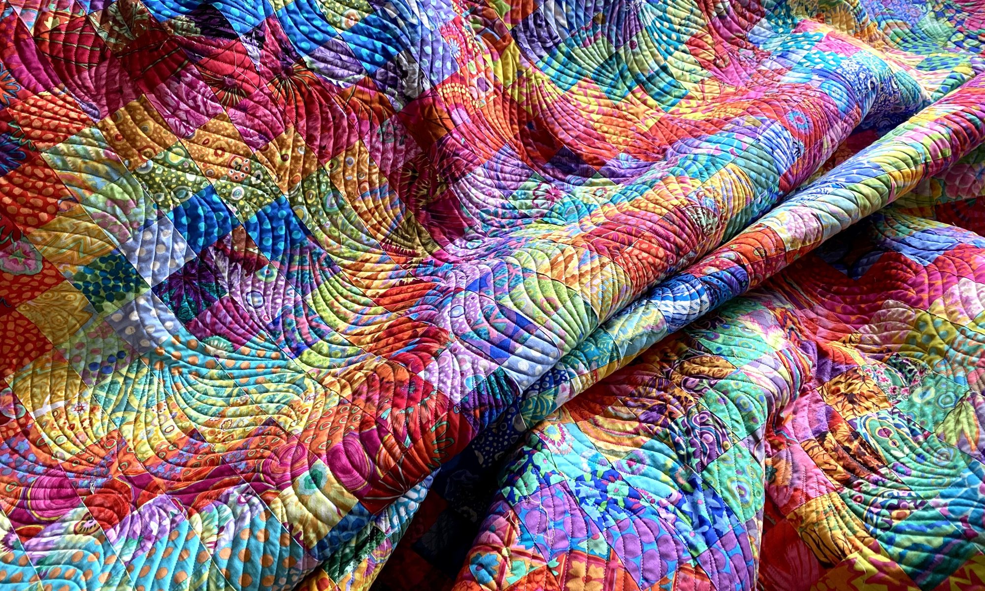
But I did spend a few minutes in my sewing room tonight auditioning some potential backings for my Jumble Starburst quilt. I had a particular piece of fabric in mind for it, but I’m not sure it’s really the best option.
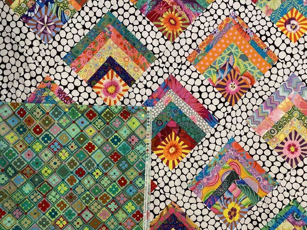
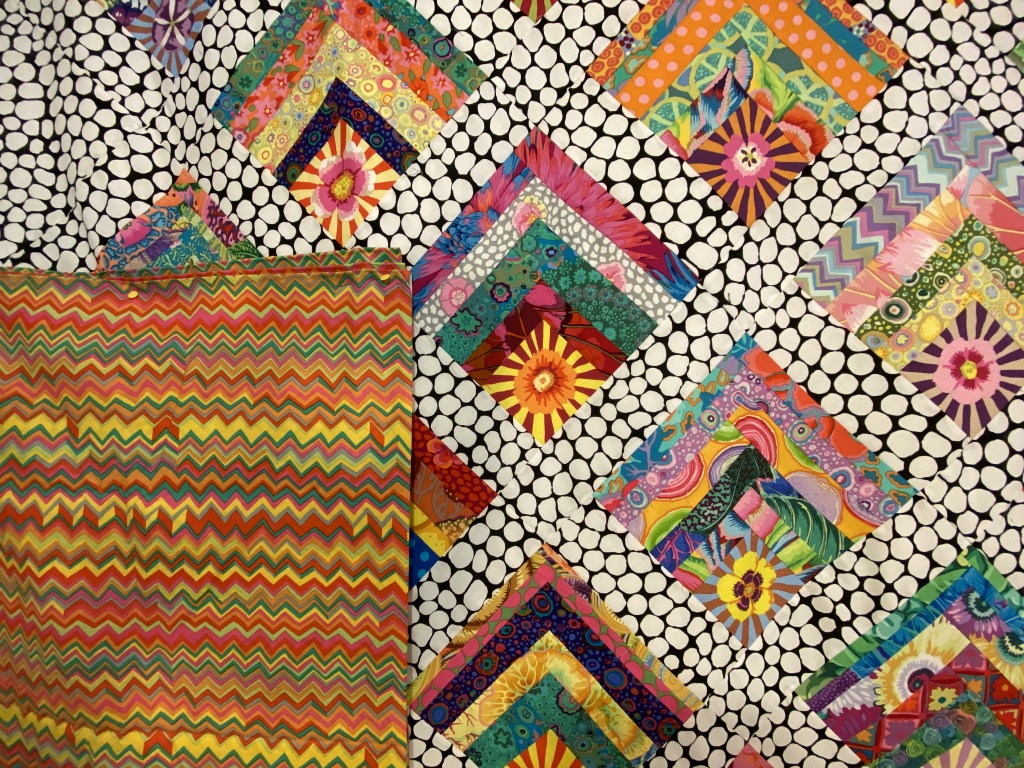
I have four options. If you’re inclined, let me know in a comment which one you like and tell me why you like it. It’s fun to see what others like and learn why a particular option works for them.
Here’s option number 1 — Kaffe Layered Stripe in red.

A closer look…

Option number 2 — Kaffe Heraldic Sheilds in green

A closer look…

Option number 3 — Kaffe’s Antwerp Flowers in green

A closer look…
Option number 4 — Brandon Mably’s zig zag in the bright color way

A closer look…
Let me know which one you would choose and why by leaving a comment.
Like I said, the one I had planned to use isn’t really working for me. There are two other options I like. One I don’t like so much. It will be interesting to see how my opinions jive with others.
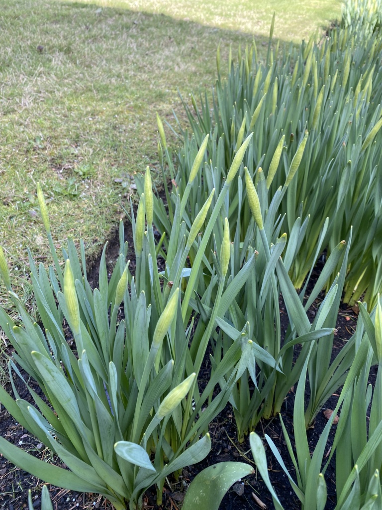
It was a beautiful spring day today. It was in the high 40s and we had a good deal of sunshine throughout the day. I did a short walk around my yard this afternoon to see how spring is progressing.
My daffodils have bulbs that are forming quickly. Won’t be long until these start opening up.
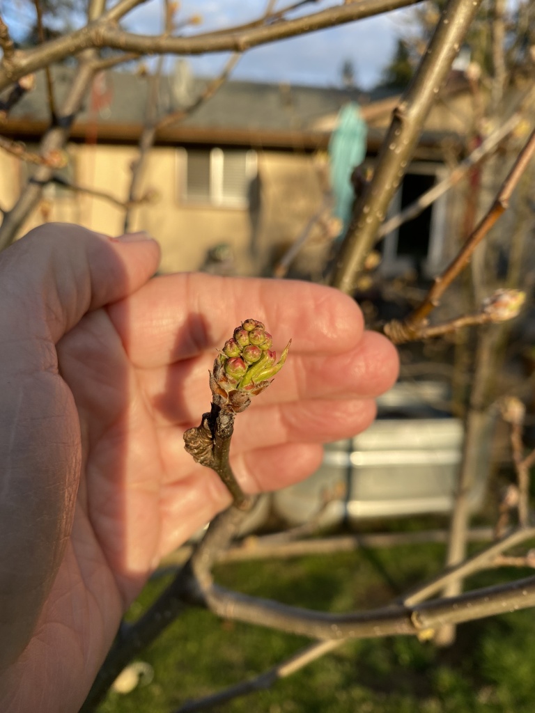
My flowering pear trees (I’ve planted 11 of these in my yard!!!) are forming buds nicely. They will be blooming soon.
The blooms on my forsythia are just starting to open.

For my mother, the forsythia was her indication that spring had arrived. We have many family Easter photos posed in front of the forsythia bush!
I’m already loving the light in the evenings. Look how pretty it was tonight!
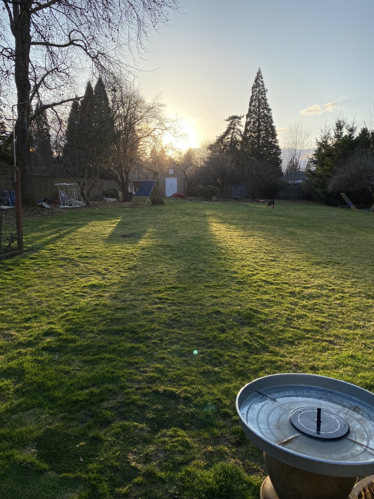
The lawn has just started growing in the last few days. It seems that everything is convinced that spring is really here!

Out of the 4, red. Love the vibrancy. What about something that is more black than white. I’m sure whatever you choose will be great. I haven’t really seen any of your quilts that don’t work.
LikeLike
Hi Anne
I’m not a fan of options 1 or 2. They’re bright and big, but just not my favorite in this case. Option 3 would work for me because it has a lot of the same colors as in the blocks on the the front, but my favorite is the zigzag in gold. I just am drawn to the gold and autumn colors and I would ick it if it were my quilt! Anyway I’m sure you’ll pick the right one the works for you! 😊
LikeLike
I like No. 4. It enhances the golds and yellows in the quilt.
No. 1. Makes the quilt look washed out and lifeless. The same with No. 2.
I thought I liked No. 3 but then I saw No. 4!
But, of course, this is only my opinion from your photos and it is your quilt, which I think looks lovely.
If I had made the quilt I probably wouldn’t add any borders at all.
LikeLike
Option 4. The points of the zigzags harmonize with the points of the blocks. And the colors just feel right.
LikeLike
I like option 3 – Keffe’s Antwerp Flowers because the stardust in each block looks like a flower and therefore the theme appears to be repeated in the backing. The green background is also beautiful and somewhat muted which makes the flowers appear even more beautiful.
LikeLike
I like the last photo with the zigzag.
The oranges keep the general tone of the quilt like a garden to me. Very soothing and on the quilt no competition with the front.
It’s lovely!!
Are those Bradford pear trees? I hope not as many states are looking at banning them as they are invasive.
I do love their blooms though.
LikeLike
I like the zig zag orange. It seems to mimic the blocks and there’s a fair sprinkling of yellow and orange in the blocks.
LikeLike
Sorry, I looked at the samples before reading the email properly!!
I didn’t realise it was the backing and not borders. Teach me to read things properly.
My choices remain the same. I like bright backings.
Your garden will be beautiful when all the blossoms burst out!!
LikeLike
I really like #3. It compliments the front with the square shapes & also the floral design inside of them. It doesn’t compete with the front.
LikeLike
I love Antwerp Flowers! Its on-point design echoes the blocks on the quilt top, and its scale is just right, in my opinion.
LikeLike
Fabulous quilt.I have enjoyed watching your process. Thanks! I like backing #1, the colors feflect the top. I’m a teal/aqu person so #3 comes in a close #2.
LikeLike
All four options look nice with the quilt top in terms of color. The fabric pattern of one is my least favorite. The third option reflects the top nicely but too matchy-matchy for my taste. The fourth option is my favorite. Love the orange/gold tones and zig zag shapes. I miss the forsythia hedge we used to have at my childhood home….a sure sign of spring.
LikeLike
I like the zig zag print the best…it just seems to look better with the quilt front… don’t like the greens at all… sounds like you’re in a slump… take a break from sewing for a bit … that’s what I do when I find myself procrastinating…it really does help…
LikeLike
1st choice is K Fassett #3
The small squares don’t overwhelm the striking quilt front. The co!or blends well with the front
LikeLike
I like the orange chevron the best. It picks up on the colors in the top. Second choice would be the green squares because the shapes match front and back.
LikeLike
–I like #1 because the variety of colors play well w/the front and the bars of color mimic the log cabin construction while the absence of flowers and circles is a nice contrast to the front. If you are leaning green, I’d vote #2.
–Since sewing the backs for your various quilts isn’t thrilling you (understandable!), put all of that fabric back in your stash (cuz you know you’ll use it!), find some 108″ fabrics on sale and then head to your quilter! Life is too short . . . . . 😀
LikeLike
I think I like option #4 the best. The colors don’t fight with the front as much.
LikeLike
Interesting how many people like #3 best – my least favorite. For me it’s between #1 and #4 – both vibrant, strong, geometric prints that can hold up to the beautiful strong colors of the quilt front.
I’m new to your blog and love both your quilts and your dogs! I have a greyhound – definitely not in the working class of dogs. She’s fast but otherwise a couch potato. Can’t wait to see what you do to finish this lovely quilt.
LikeLike
I like #3 best (followed by #1). I love the colours of #1 and I love that it reflects the pattern/shapes of the quilt gop.
LikeLike
I like no 4 as first preference. I like the colours and to me it looks like the little squares are on point also.
LikeLike
I like option 4
LikeLike
For my vote, it’s either number 3 because the design ties in so well with the front, or number 4 for the colour, which so compliments the front.
Well done in finishing that quilt top…gosh it was a challenge!!
LikeLike
Amending my earlier comment which didn’t make much sense!! I like #3 best because I love the colours and I love that it echoes the shapes of the quilt top! I like the colours of #1 too and think that would blend well with the quilt top.
LikeLike
It’s #3 for me as it pulls all the colors together again to the back. # 1 makes the bright colors of the quilt ‘die’. 2 isn’t the right feel and 4 would be more work to match the zigzags (I think that’s needed) I hate the 3 B’s of finishing a quilt. Backing, binding and…bitching! Love seeing all your work!!
LikeLike
I like Brandon’s zig zag in the bright color way the best. It brings out the orange in the quilt top and goes beautifully with it.
LikeLike
No. 3 for me as it sets off the colours of the quilt best and doesn’t fight them
LikeLike
Moi je choisirai le 4 car ce vert est magique et c’est le printemps.
LikeLike
Well, it looks like I’m going completely against the flow here. Firstly, I’m not a huge fan of Kaffe Fasset fabrics (don’t hate me). I like some, but not all, of them. So I’m going with number two. I like the vibrancy of the lime green. I think the others are a bit too predictable with the colours on the front. Again, each to their own. I might have chosen a completely different, ie, not Kaffe fabric, for the back. But I mix up ranges of fabrics and pay little attention to the designer (sorry designer). You have a wonderful collection of Kaffe, so using what you have makes sense, and in that context I would use the one that looks least Kaffe and most random.
LikeLike
I absolutely prefer option No. 1 and 3.
The others look colorless, and the quilt is colorful.
If you have a fabric with black and some colors from the quilt
I would absolutely prefer that.
I can see from your pictures spring is coming fast now.
I think Oregon must be a lot warmer than here in Denmark.
My dafferdills are only about 4 inches high.
You are a big inspiration for me when I make patchwork.
Thank you so much.
LikeLike
I like #3 because it echoes the on-point blocks on the quilt top and is a more subtle pattern. The other patterns and brighter colors seem to “fight” with the top.
LikeLike
I love reading your blogs every day. I don’t know how you find the time but they really cheer me up. I prefer your first option of backing, the red one. The colour just brings out the colours of your quilt top. Love your beautiful dogs and love your wonderful work. Your eye for colour and design is fabulous. With love from Julia in Woolverstone, Suffolk, YK.
LikeLike
Hi, I’m underside between no. 3 or 4 but no.3 is sightly winning. Its more interesting than the first 2. Its seams to pick out some of the colours of your fabrics but the more I look at them I’m thinking they are all abit to busy, your quilt is so beautiful that I think I would put a less busy back to it. BUT I’m no expert and you are always bold in your choices. I can’t wait to see which one you go with.
LikeLike
I love the zigzag as it zings the quilt, picking up many colors and mimics the design.
LikeLike
Mmm. I would choose something less strong
LikeLike
I would go with option #3. No other resaon than that is the one that when I saw it made me smile.
LikeLike
I like the layered stripe. The bold reds play well against the black and white. The others, except the shields are good, but not as bold as #1 Kaffe. Go bold or go home 🙂
LikeLike
Wow, lots of interest here. Either 3 or 4 works for me Anne, primarily because they please my eye. If you plan to have the back on display, that may impact on your decision. i always go with my heart when thinking of colour.
LikeLike
Definitely option 1 kaffe layered stripes in red picks up all the colours in the quilt top
LikeLike
I like the red, which would also be fun for a binding. I love a crosscut stripe for binding! Second choice would be the Antwerp flowers in green. That would be a calmer, prettier option that echoes the design of the blocks on point setting; with that backing I’d probably use the sashing fabric for binding. Happy quilting!
LikeLike
I like option 3 because it blends so well with the front.
LikeLike
My Choice #1: Kaffe’s Antwerp Flowers in green
Reason: As several others have mentioned, the fabric design is on point, which is the same orientation as the front, and the little flowers in the boxes are similar to the sunburst flowers on the front. Additionally, the smaller boxes as well as the flowers inside the boxes are made up of a variety of colors, all of which can be found on the front. Depending on which one you look at, different colors pop when looking at the quilt front. The feeling I get when looking at this choice is calmness, peace, and serenity. An added bonus is that it’s green, which as I recall, is your favorite color.
Reasons for not choosing the other options:
Option 1: (Kaffe Layered Stripe in red) does bring out the colors in the quilt front. However, to me, it is too jarring and in your face. It seems to be stealing the show from the beautiful front.
Option 2: The color seems too washed out and doesn’t make the front of the quilt pop. The designs remind me of neckties or wrapped candies, neither of which go with the flower design. Silly, I’m sure.
Option 4: (Brandon Mably’s zig zag) It’s just way too orange. It does a nice job bringing out the orange in the quilt front, but all my eyes see is orange. The other beautiful colors seem to get lost.
There are a lot of opinions out there! I’m confident that you’ll choose the one that is right for you. After all, it is your quilt and you’ll be the lucky one enjoying it. I’m looking forward to seeing which one you choose.
LikeLike
My choice is Number 3. In the photos, No’s. 2 and 4 dull out next to the top. I like the color of No. 1, but the pattern in the fabric seems to compete with the top as opposed to complimenting it. No. 3 works!
LikeLike
It would be very hard to decide! I would choose Option 3 – Kaffe Antwerp Green – it just “clicked” with me. Good luck!
LikeLike
Option #2 is the only one I would not choose. Too light.
The others all pull colors from within the quilt, therefore being better complimentary colors.
Equally like 1,3 &4.
LikeLike
Antwerp. The others are too directional.
Sent from my iPhone 10
<
div dir=”ltr”>
<
blockquote type=”cite”>
LikeLike
Antwerp flowers , the squares and the flowers echo and complement your beautiful front !
LikeLike
Option number 4 — Brandon Mably’s zig zag in the bright color way
I think the intensity of the red is gorgeous but too much for this quilt. The green doesn’t suit it.
#4 is beautiful and has some zing on the back, but not so much as to be overwhelming
LikeLike
You are blessed with great options, but I’ve been thinking about this for 10 minutes. I like the Brandon Mably zig-zag and I can’t believe I’m writing that because those tones are unexpected for me. To me they bring a sort of cozy comfort that I’d like to snuggle with. Just for fun, I asked my husband to choose, and with no hesitation he chose the green Antwerp Flowers. (Pretty funny to me because he is normally all about red.) He thinks the green matches the colors in the front the best. The Antwerp Flowers was my original choice before I changed to the zig zag.
Weather wise, we will be cutting our grass this week and the pear trees are blooming. Forsythia has been blooming for a while. This house, bought for retirement, is the first house I’ve lived in that does not have forsythia. I miss it. We’ve also had snow flurries this week. (Virginia)
LikeLike
I like #3 the deep green and square flower center pull’s all together.
LikeLike
I like option #3, It compliments all of the colors on the front and it feels more calming than the others.
LikeLike
My first choice would be Brandon Mableys zig zag; it really picks up the yellows and oranges. The greens and blues become secondary.
LikeLike