I’m still not quite ready to get into my sewing room and fire things up. I think I’m hesitating a little because I have many backings that need to be made. I’m not looking forward to manipulating and handling all that yardage. So I think I’m procrastinating a little.
But I did spend a few minutes in my sewing room tonight auditioning some potential backings for my Jumble Starburst quilt. I had a particular piece of fabric in mind for it, but I’m not sure it’s really the best option.
I have four options. If you’re inclined, let me know in a comment which one you like and tell me why you like it. It’s fun to see what others like and learn why a particular option works for them.
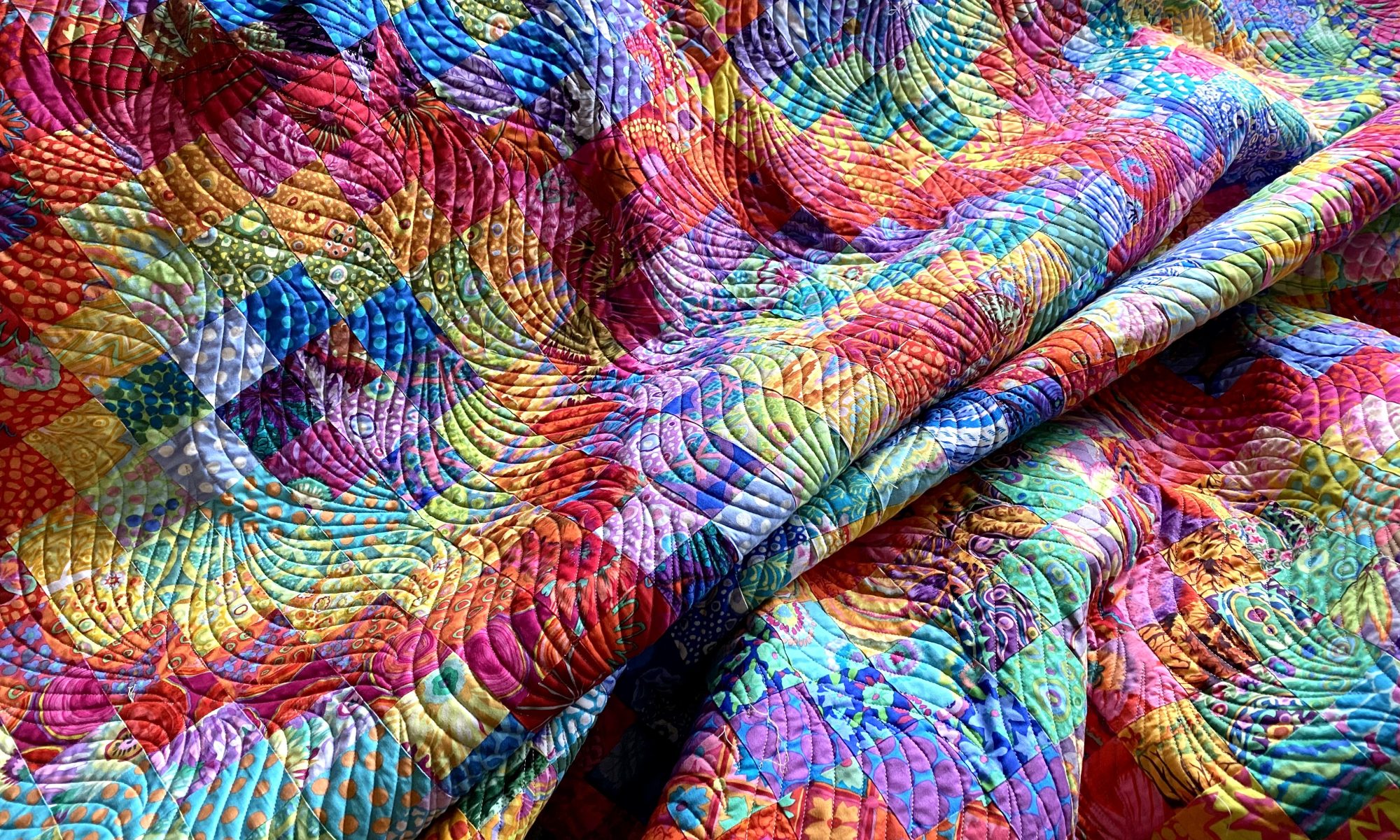
Here’s option number 1 — Kaffe Layered Stripe in red.

A closer look…

Option number 2 — Kaffe Heraldic Sheilds in green

A closer look…

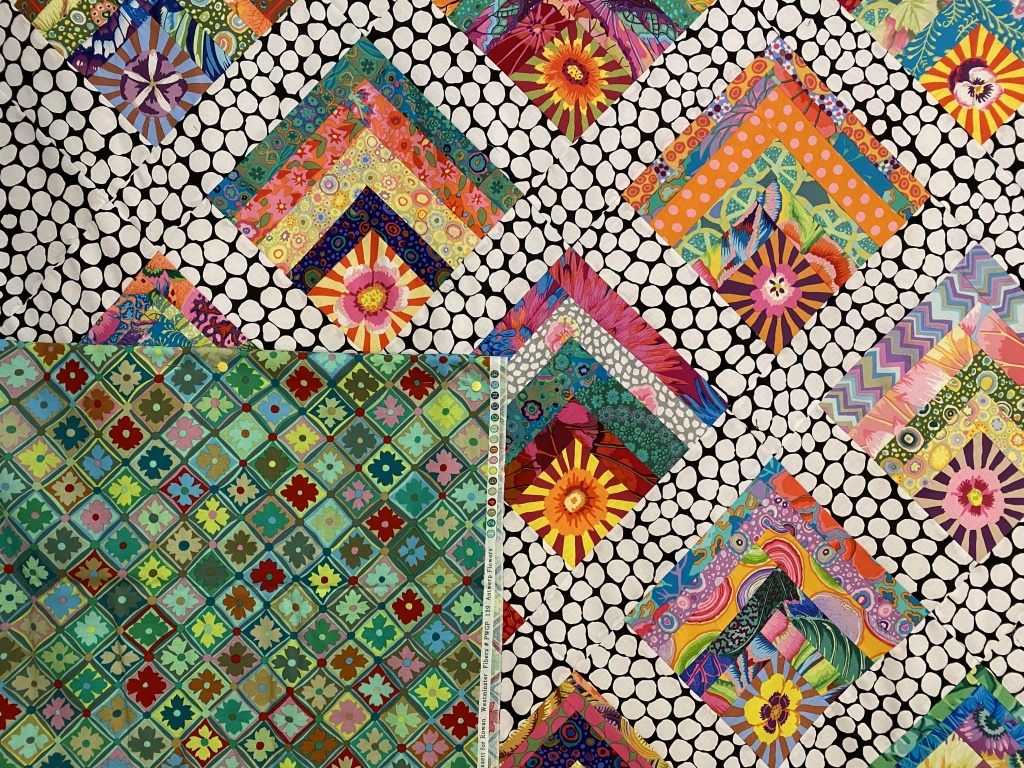
Option number 3 — Kaffe’s Antwerp Flowers in green

A closer look…
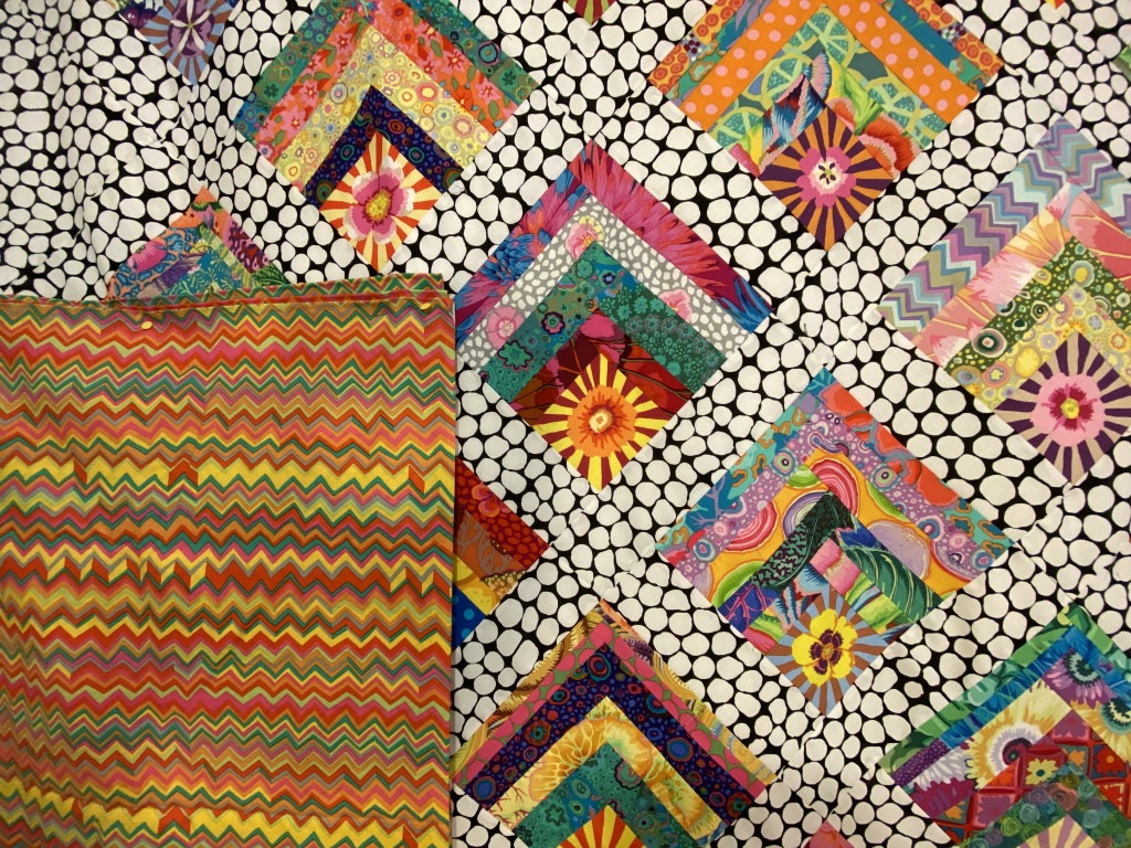
Option number 4 — Brandon Mably’s zig zag in the bright color way

A closer look…
Let me know which one you would choose and why by leaving a comment.
Like I said, the one I had planned to use isn’t really working for me. There are two other options I like. One I don’t like so much. It will be interesting to see how my opinions jive with others.
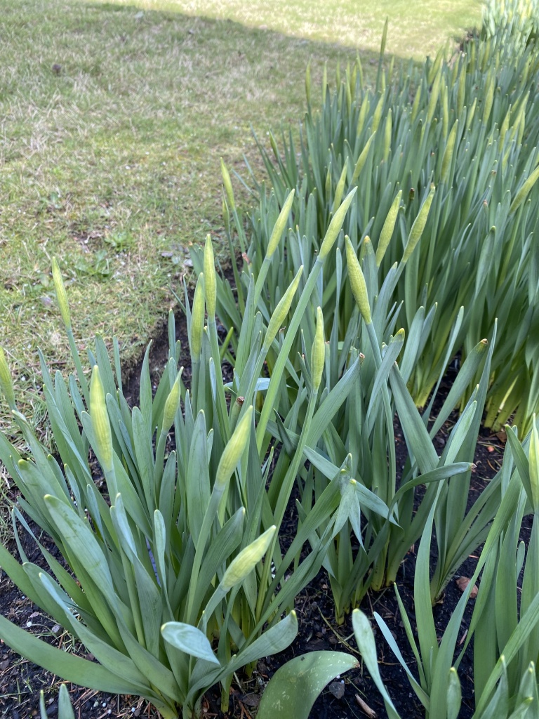
It was a beautiful spring day today. It was in the high 40s and we had a good deal of sunshine throughout the day. I did a short walk around my yard this afternoon to see how spring is progressing.
My daffodils have bulbs that are forming quickly. Won’t be long until these start opening up.
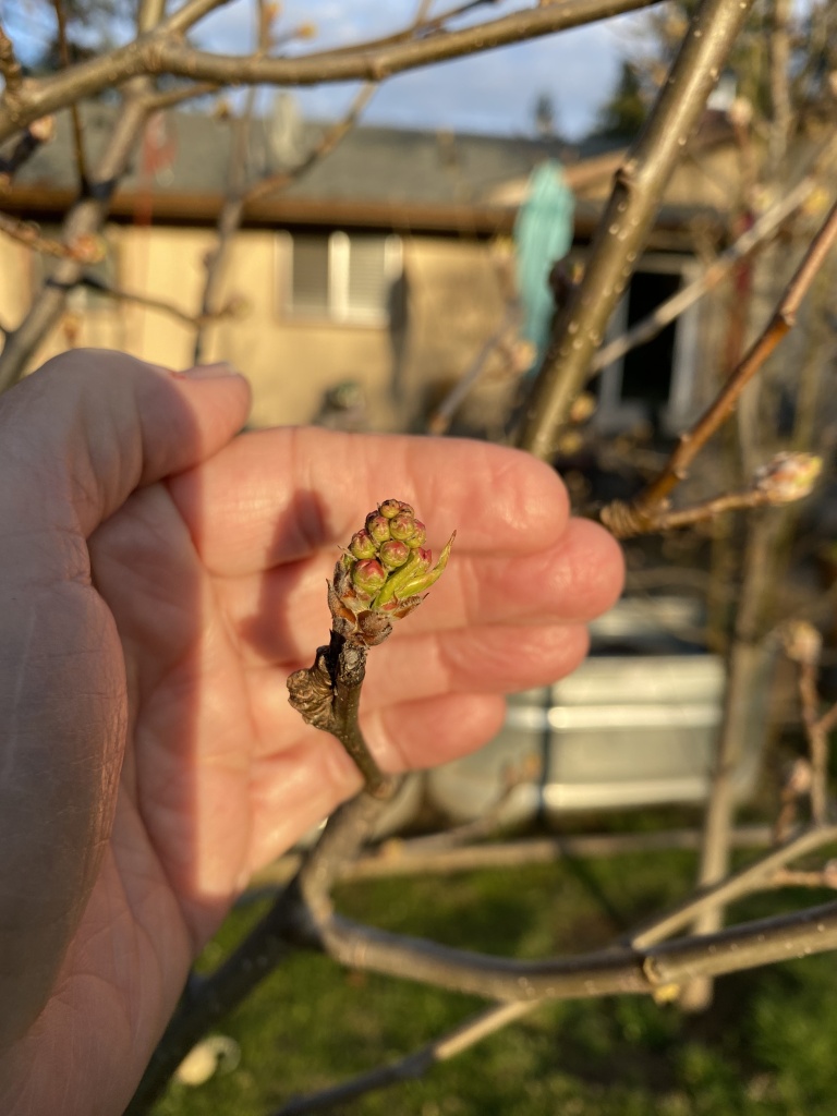
My flowering pear trees (I’ve planted 11 of these in my yard!!!) are forming buds nicely. They will be blooming soon.
The blooms on my forsythia are just starting to open.

For my mother, the forsythia was her indication that spring had arrived. We have many family Easter photos posed in front of the forsythia bush!
I’m already loving the light in the evenings. Look how pretty it was tonight!
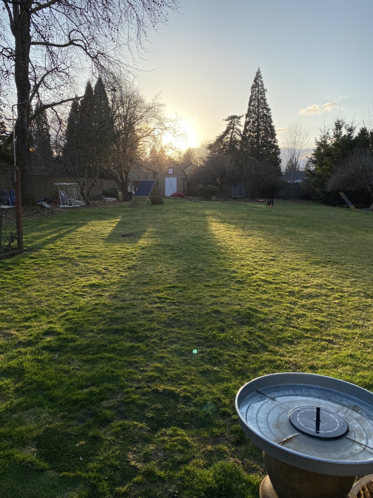
The lawn has just started growing in the last few days. It seems that everything is convinced that spring is really here!

Zigzag and Antwerp flowers work for me. Seems like they complement the quilt. Their patterns harmonize with the front. Have fun! Spring is arriving here too. Trees are getting tiny leaves ready to unfurl. Daffodils are blooming. Love this time of year.
LikeLike
#4 it shows the colors and fun without over powering.
#1 is my second choice but seems a bit overpowering.
LikeLiked by 1 person
I like option 4. I think the warm colors pick up the warm tones in the blocks, and the zigzag echoes the lines in the blocks as well as the setting. Plus I just find the warmer tones “sunnier”.
LikeLike
I love the first option, Kaffe Layered Stripe in red for your Jumble Starburst quilt. I think it goes best with all the colors in the quilt and personally, I wouldn’t mind occasionally turning the quilt over to see that beautiful fabric on the back.
LikeLike
Definitely the #4 zig zag. It “reads” Sunny and goes well with the Sunbursts!
LikeLike
Love the first one- pink- it just “feels” good to my eyes, and makes all the colors come together and pop. Cheers!
LikeLike
1 and 2 don’t really resonate with me. I am having a hard time seeing their connection to the quilt top. I love option 3 – color, and the squares on point integrate with the top. I would probably pick 4 however because I am not a fan of the fabric in general, but the colors go well with the top and I could use it up.
LikeLike
Heraldic shields in green. It is more muted and I like it because the front is very vibrant and I think needs a more subdued backing.
LikeLike
I like the green as it repeats the square pattern only on a smaller scale and they seem to belong together.
LikeLike
I think #4 looks best. It brings out the warm colours in your beautiful quilt
LikeLike
The gold fabric.
LikeLiked by 1 person
I liked the ZigZag. The colors in it make the golds/browns/oranges in the quilt top pop and counterbalances the black and white. Also the zigzag pattern echoes the blocks on point of the front. The greens for me tended to mute the front. The red overwhelmed it. Good luck deciding.
LikeLiked by 1 person
I like the first option because the stripes mimic the logs in the blocks.
LikeLike
Number 1 is my favorite, it sets it all off nicely and is more interesting than number 3, which is my second choice, but it is almost too matchy matchy. I do like the way number 3 repeats the on point of the front of the quilt.
LikeLike
I’m loving the RED!
LikeLike
1 — Kaffe Layered Stripe in red. This would be a lovely border for your quilt and give a great frame to showcase the blocks. Love your quilt. Truly appreciate all the great ideas you share, you are an inspiration. P.S. Love the photos and reading about the “escapades” with your border collies!
LikeLike
Good afternoon, I am Fina from Barcelona, I think option number 3 highlights the quit more than other opcions. Number 1 is easier because fabrics have stripes, but I prefer number 3.
LikeLike
Option 5: Enchanted in Red
https://www.etsy.com/listing/1299309359/enchanted-red-108-wide-back?ga_order=most_relevant&ga_search_type=all&ga_view_type=gallery&ga_search_query=kaffe+fassett+fabric+108%26rdquo%3B+wide+for+backing&ref=sr_gallery-1-3&organic_search_click=1
Also, millefiori will soon be available in 108 wide (pre-order available online). I see you used some of it in the quilt. It would work if you want to move away from red for the backing. IMO, Enchanted would be better than millefiori.
LikeLike
I like the orange first option. It is vibrant and offsets all the black and white jumble nicely bringing out the colors in the squares.
LikeLike
2 and 4 as they don’t compete with the lovely pieced top
LikeLiked by 1 person
The zigzag bright really seems to pick up all the colors on the front of the quilt
LikeLike
From the point of view of a longarmer, I would choose the Heraldic green because it is the same value as the front.
My personal choice would be the red stripe because it would make it look cosy and I like red.
LikeLike
I look forward to your blog since my 90 yr old fingers get in way for producing my ‘first love. My vote is #4 and second choice #1 because of value and size of design..also mimics the rick rack look
LikeLike
I like either the Shields in Green or the last one the Zigzag.
LikeLike
Cc tout est sublime mais pas facile de choisir toutefois le 3 me fait penser au printemps qui arrive
Gros gros bisous 😘
LikeLike
Nice choices! I would pick #4 the zig zag because it compliments the front without mimicking it; perfect warm color and not too match matchy. Love Brandon’ designs for backings and binding! #1 red stripes would be my second choice, also compliments the top, but might be too bold and detract from the top. #2 heraldic would be my last choice, probably because I’ve never liked that design and I am not attracted to green for this quilt. 🙂 #3 Antwerp flowers is boring, too matchy matchy, and again, the green doesn’t work for me. Save it for something else.
LikeLike
I would chose option 4. It has all the colors oft the quilt top, yet not too loud nor week nor busy as the other options. Just my thoughts.
LikeLike
Hello,
I immediately chose the last 4th choice. The zigzag
And colors seemed to go with the busy sunburst pattern.
I love reading your blogs and although I never made a quilt, you inspire me to start.
How do I start? Should I buy a kit??
Annette Berenholz
LikeLike
I vote for Option #3 because it includes all colors in the quilt top and the geometric design in #3 is a repeat of the flower-within-a-square in the blocks of the quilt top. Similarities aside, Option #3 has a distinct personality of its own.
LikeLike
I personally like the flowers by kaffe, or choice number 3. I love it for the calming relaxing effect, and the way the flowers are made, they draw you in to see the quiet pale blue. It looks wonderful with the white on the quilt, that looks like stones, like for a bed for the flowers. The variety of the flowers also look wonderful with the blooms of the top of the quilt–so one day large flowers, small on the back. In a flower garden you have the small flowers for background if you will, and the the large bold sisters to shine on. Thank you for allowing me to voice an opinion.
LikeLike
Brandon Mably’s zigzag is my top choice. I decided this by scrolling very quickly through your posted pictures and it definitely brings out the best in your quilt top. Good luck making the decision.
LikeLike
I just love this quilt!
<
div>Picking backing is usually not my favorite thing to do. However, the greens
LikeLike
Love the green. It emphasizes the overall design and wonderful center flowers. Thanks for sharing your process. I have learned a lot from you, particularly related to color. Tracey Phillips
Sent from my iPad
>
LikeLike
I liked the first option for your backing. The red one. It sparks. It picks up the red on the front.
LikeLike
I think I’m going to go with the Brandon Mably zig zag. It goes well with the colors on the front and is a very playful note. None of these options is a bad choice though!
LikeLike
first choice #4, second choice #1 , third choice #3. I think #2 is too pale and other than just wanting to use it up, I wouldn’t do that one. I like warm colors better with the top but #3 green isn’t bad. My choice however would be to use #1 because that one is taking up real estate in your studio and a backing would be the best use for that fabric…..unless you have another quilt that could use it for a backing. I think it looks great with this top because the strips of stripes in the print echo the stripes in the blocks.
LikeLike
Hi, I like the Antwerp flowers in green the best. The red is my second choice. I like how this Antwerp flowers fabric brings out the blues but also compliments the oranges and peach tones nicely. It also seem like a similar intensity. While I love the red back it steals the attention from the quilt probably due to the intensity of the hues.
LikeLike
I vote option 2 – love that yummy green! 💕
LikeLike
I love the red!, option 1 it’s as bright and beautiful as the front side
LikeLike
Absolutely option #3! It just flows with the quilt…and the green is a bonus!
LikeLike
None of the fabrics. All the patterns and colors are jarring, would ramp up competition with colors and patterns used in the quilt top. The fabrics shown for the backing are gorgeous and could be used in future quilt tops . Would not waste it on the backing. I would go with a dark solid for the backing or a pattern that contained black . Low key. You could continue the fabric used for front sashing around to the back after separating with a narrowing border . Binding in the same color
LikeLike
I had thought the red would work at first, but I vote for the Brandon Mably’s zig-zag. It seems to make all the colors shine on the quilt top without taking away anything or competing. I enjoy reading your blog. The quilting drew me in, but the dogs and profanity made me a loyal fan!
LikeLike
I chose your last choice – Brandon Mably’s zig zag. I think it coordinates wtih the top pattern better. Just my opinion. 🙂
LikeLike
My preference would be #4 closely followed by #1. To my eye, #3 is too busy to be used with your busy jumble fabric and #2 looks drab and kind of blah against the bright colors on the front. The rectangular shapes and bright colors in #4 and #1 repeat shapes on the front and are a really nice contrast to the jumble fabric. I think I like the yellow best because it says spring and sunshine to me.
LikeLike
Number 1 & 4
Love the contrast!
LikeLike
Option #3 because it sort of mimics the front design.
LikeLike
I like either 1 or 4. I like the range of colors on 1. They blend really well, but I like the pattern of #4. I think the colors blend well and are easy on the eye but #4 may be to gold with no blue or much red.. #3 is just too much chaos and my eyes need a rest and I don’t think #2 goes. If I had to go with any of them, it would be 1 (I think). You are always so good and intuitive at matching up patterns. Trust your gut.
LikeLike
Hi Anne, I love Option 1 – Layered stripe. I think it matches you and beautifully complements the quilt top. The other options are not what I invision as you (#2 is too pastel for you), and #’s 3 and 4 don’t do the quilt top justice! No matter what you choose, I know it will still be a great work of art!
Best, Diane Gresham
LikeLike
I like number 4. It is a bit toned down and with the wild front, I like the calmer back.
Linda
>
LikeLike
I like #3 because the color is a good fit and I also like the on point match. I have never liked the option#2 print. Since the quilt is a gift, I would use that, LOL.
LikeLike
Option 1 I like the red it stands out
LikeLike