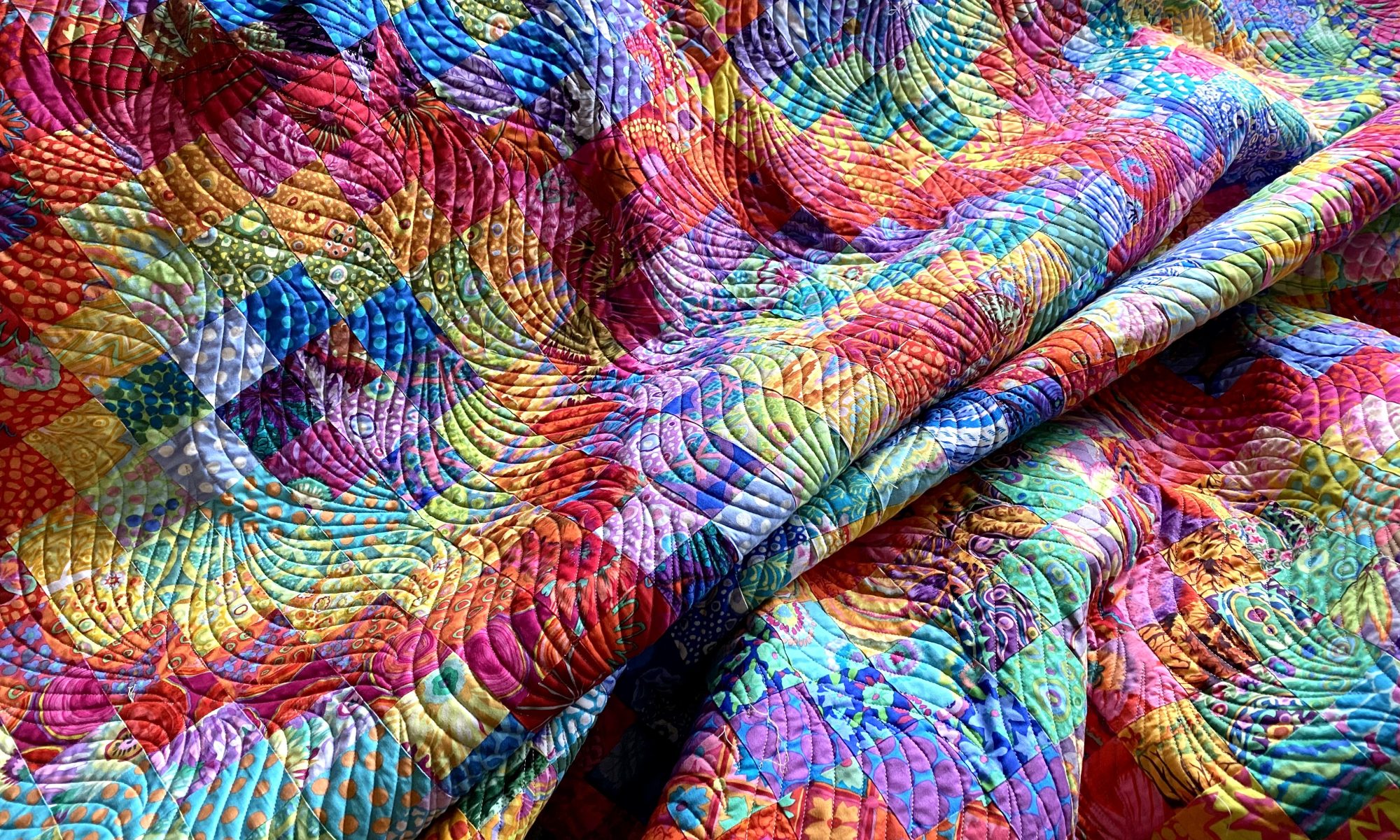
First off, thanks to the 127 of you who took the time to write me a comment about which backing option you preferred. I had a great time reading all your thoughts and opinions. And I have to say… YOU ARE AN OPINIONATED BUNCH!!
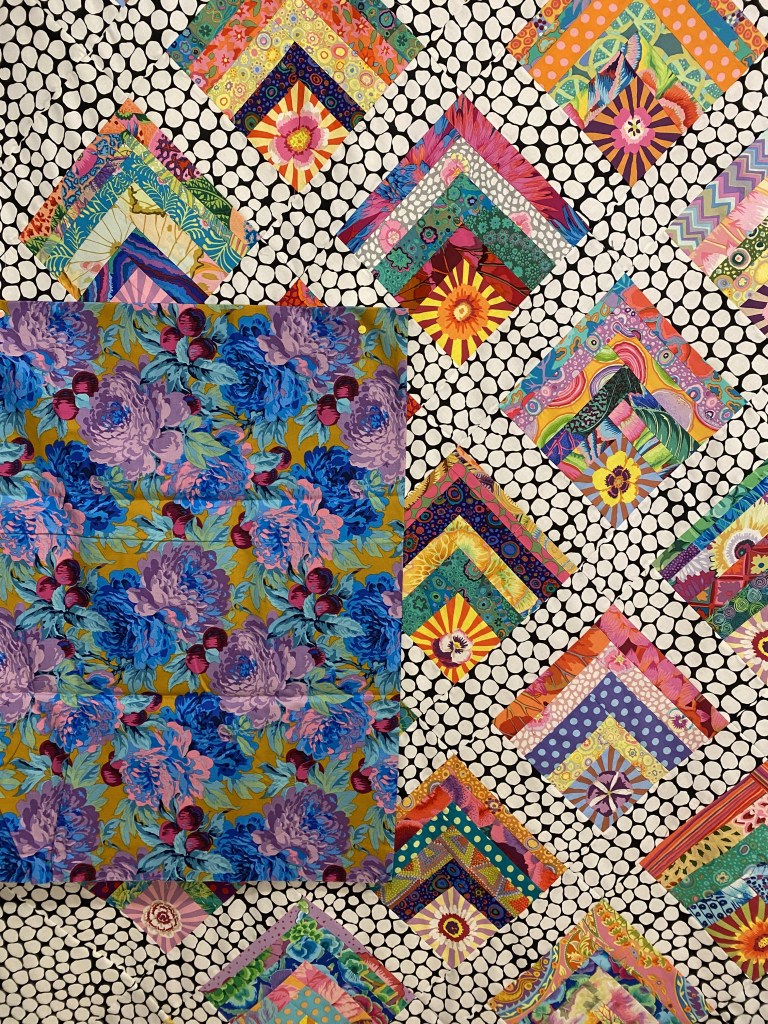
First off, I want to let you know what fabric I had HOPED would work as the backing for this quilt. This one.
I just LOVE that fabric. I bought it on sale many years ago and I have wanted to use it as a backing but have never had a quilt that really worked with.
I’m really disappointed that is just doesn’t work with this quilt.
I’d like to thank the handful of very tasteful and adventurous people who said they like this option the best. And for those of you who boldly expressed things like “meh” and “just no!” I invite you to embrace your inner green! It’s the best color on earth!!!
As I saw all the comments coming in throughout the day I had a sense that one option was the run-way winner. But I decided I should actually count the votes and see where we ended up. Since some people were as indecisive as me, and consequently no help at all, the total votes don’t add up to the 127 comments.
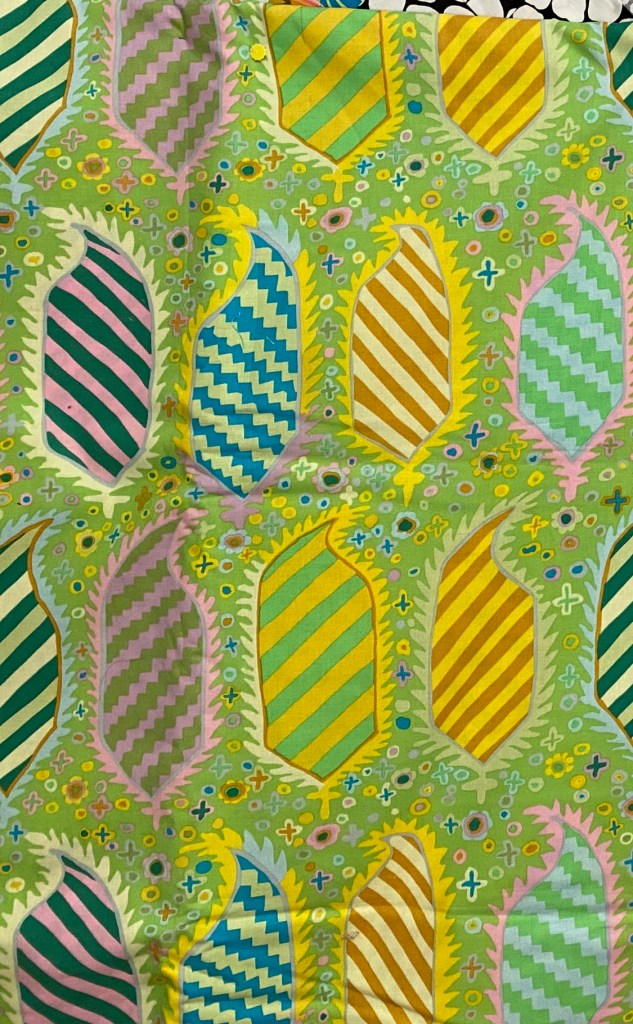
Firmly in last place, to my grand disappointment, is the paler green that I had my heart set on. I LOOOOVE that fabric, but I agree that it’s not right for this quilt. This fabric garnered 9 “yes” votes. I’m not going to tell you how many “no” votes it got.
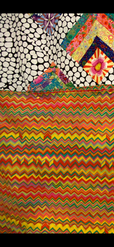
Second and third place are neck and neck. The option 1 red fabric got 23 votes and the option 3 green Antwerp flowers got 24 votes.


And the clear winner with 32 votes is option 4, the bright zig zag fabric.
And after all that I’m laying on the sofa with my lap top on my lap and I’m laughing because I’m still as undecided as I was before all of this!!!
I think these options are fine. But not of them really grabs me.
So which one of these would I actually choose if someone forced me to? I’d probably have to go with the red option #1. But I can’t tell you that I love it.
A couple people were very certain that I should select something else. But I would really like to use something in my stash and these four were the best option. If I was going to BUY a backing fabric for this quilt, it wouldn’t be any of these options.
So now what?
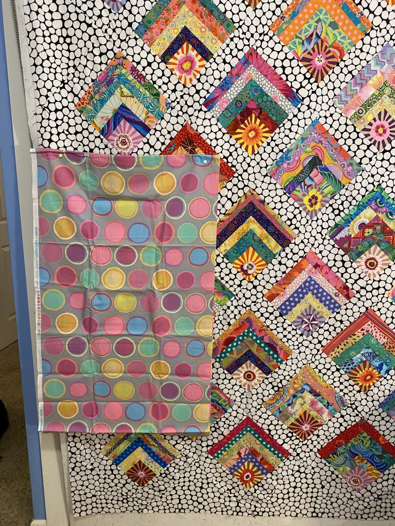
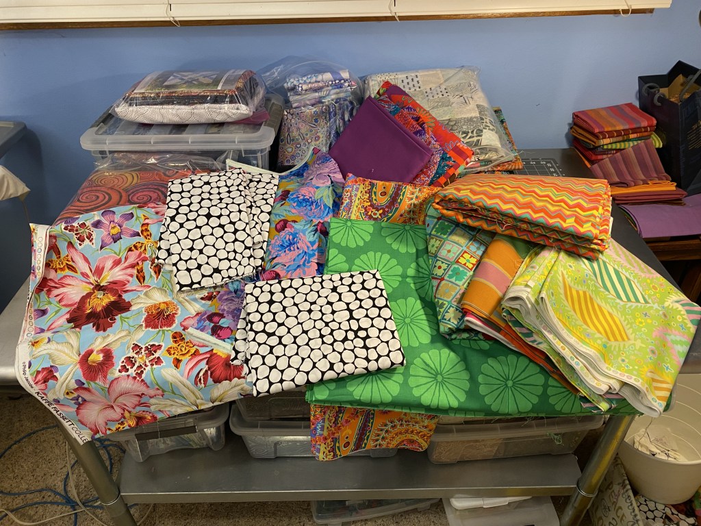
I decided to look in a drawer in my sewing room that’s filled with pieces of fabric that are larger than my typical stash fabrics, but not large enough for a full backing.

I thought I might be able to find something that works, but might have to be combined with another strip of fabric to make it big enough.
I pulled out a few pieces that were definitely NO!

Yeah. Definitely YUCK.
But there are some options that are more interesting.

I’m not sure about the blue/purple one. There is just so little of those colors in the top. The middle one is very bright and cheery. The last one is a definite option for me and it’s one of my favorite Kaffe fabrics ever.
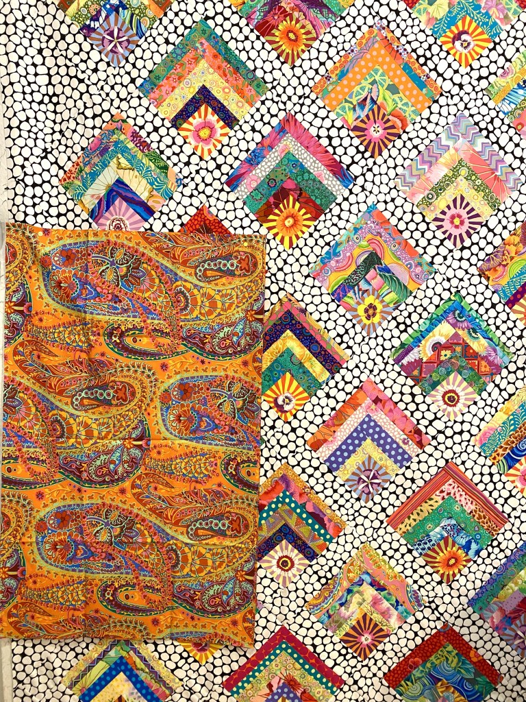
These last two are the most interesting to me. First, this gorgeous orchid print painted by Philip Jacobs. It’s such a beautiful fabric and I like it with this top, but it all feels a little to medium to me. I feel like the back of this quilt needs to be more saturated and deep in color.
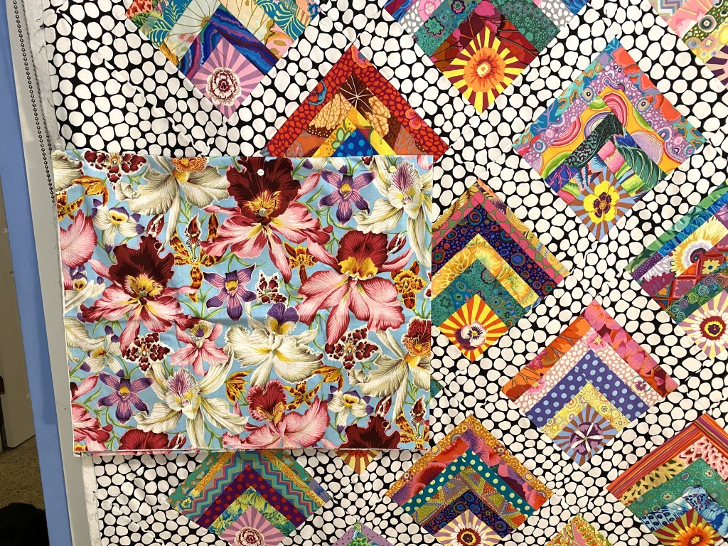
I have a couple pieces of this but would have to be combined with another fabric to make it large enough. There is a jumble that goes nicely with it that I could use.
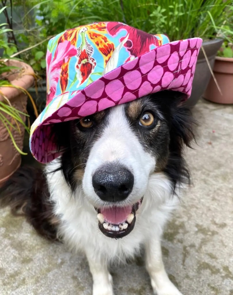
That photo gives you a better idea of the colors in that fabric. It also gives you an idea of how freaking cute Bender is!!!
The other option that I like will not make the green haters out there happy.

There’s not enough of that green to do the entire backing. It would be combined with some of the black and white jumble.
Well, I don’t have to make a decision tonight.
Thanks again to everyone who commented. If you haven’t yet, take a few minutes to read through the comments on last night’s post. You can find the comments by scrolling down on the page. It’s really interesting to see what different people saw in each option.
I usually reply to all comments on my blog posts, but I’m not going to be able to do that since there were so many!
And I’ll close tonight with this photo illustrating what indecision looks like.

I really like this green. It’s unfussy and is a calm backing for the beautiful, busy piecing.
LikeLiked by 1 person
I like it too. It’s a gorgeous green. But I feel like this quilt needs something hot… it’s screaming for something red/pink from my eye.
Anne
LikeLike
You do make me laugh!
Go for the gorgeous green with the b/w.
Have a great weekend.
Lindy x
LikeLiked by 1 person
I love that green but it’s not quite right for this quilt. I have a piece of fabric on its way that I found on sale online.
Anne
LikeLike
I personally like the bright and cherry fabric , it seems to go well with the flowers in the quilt,in my eye. I’m looking forward to seeing what you come up with, which could very well be non of the choices above !! 🙂
LikeLiked by 1 person
Which bright and cheery fabric? There are a lot of bright and cheery fabrics here!
Anne
LikeLike
Anne,
The bright and cheery fabric is in the 3 group photo of the blue , than comes the ( bright and cherry) that i like. the next photo ( your favorite paisley jungle ) in which I think that one is too much orange !! I hope I’m not coming across even more confusing !! The photos are above the adorable Bender with the sun hat on !! Niki
LikeLiked by 1 person
I love the last combo! Th
LikeLiked by 1 person
Hello! First of all, best photo is Bender! He is just so cute and full of personality! Second, the green heraldic shields is a fun, beautiful fabric and would make a fine backing! Really, the only thing the backing needs to go with is the binding, and the only person who has to love it is you! I’m a lime green lover, it’s my favorite color, I can’t resist a gorgeous lime green print! Happy quilting, and scratch those cute pups for me!
LikeLiked by 1 person
some day I will pull the trigger and use that green. I have a quilt idea that’s been rolling around in my brain that would be perfect for it. I’ll just save it for something special.
Anne
LikeLike
the “cheery middle one.”. echos the small squares with radial flowers.
Get Outlook for iOShttps://aka.ms/o0ukef ________________________________
LikeLiked by 1 person
Well I’m not surprised th
LikeLiked by 1 person
Wow, wow, and triple wowsers â this would be my choice (even though Iâm too late for the vote):
Total and perfect match â good Lord what a beautiful combination.
Have a great day,
Eileen
LikeLiked by 1 person
The bright and cheery one that looks like morning glories is beautiful! I would choose that one , it compliments the yellow and green on front. Bender is so Frank Sinatra 😻😻😻😻😻.
LikeLiked by 1 person
Now I can comment! Nothing in the original group made my panties fly up! I LOVE the blue print with it – must supplement, I know! It brings out the bit of blue in the quilt and just makes it POP! Love the blue the best!
LikeLiked by 1 person
🤣 don’t you mean panties fly down? 🤗
LikeLiked by 1 person
Yup – think it shoudl have said SKIRT fly up!! Ha ha!!! It was early when I wrote that – and I’m sticking to that for a reason!!
LikeLiked by 1 person
Yes, yes, yes! That bright green and the jumble! Just in time for St. Patrick’s Day too. “I’ll drink to that!”
LikeLiked by 1 person
This option looks like the perrrrfect choice, I would go with this one without any question.
Good luck and donât forget you have many friends loving what you do!
Ginette
LikeLiked by 1 person
I Love the last green. None of the others seemed right.
LikeLiked by 1 person
That pile of fabrics is truly a jumble. Frankly I like the Emerald green pieced with black and white as a backing. Do whatever finally speaks to you. The quilt is fantastic!
LikeLiked by 1 person
Now that was interesting –
We all realize that we are talking about the BACK, right?
I know I said in my opinion this quilt needs a small print- however the one you said is your fav KF print “ever” orange-red larger shapes – somehow I believe would look great when pieced with the b/w jumble.
(Any jumble color would look great – as Bender knows! He looks adorable in that hat!)
LikeLiked by 1 person
I echo the comments of the person who said that the backing isn’t seen much in use so go with what you love! Also I agree with those who like the green flower/jumble combo – I find it hard to use that flower print in pieced blocks because it’s only got 2 colours in it so stands out from the rest of the KFC prints, but I think it’s lovely on it’s own and would make a great backing, agree there is something calming about it compared to the multi-coloured and complex top. I’ve also seen the shield fabric on sale in many colourways but am ambivalent – just not sure what I would do with it!
LikeLike
I have that shields fabric in green, blue and grey! I just love it but can’t figure out how to use it!
LikeLike
It must be destined for backs then 🙂
LikeLiked by 1 person
Since almost Day 1, I’ve been envisioning the black and white jumble or a similar black and white as the backing. I know it means you’d have to buy more fabric, but since you’re expert at fundraising, you could motivate everyone who voted to throw in a couple of bucks, and you’d have the funds for the perfect fabric to back this spectacular quilt. 🤣
LikeLiked by 1 person
I actually have a piece of black and white onion rings in my stash. I thought about it, but this quilt just seems like it needs some color on the back. Way too much white.
Anne
LikeLike
I was in a hurry yesterday, saw there was a vote but thought it was for the binding, so that why I picked #3.
LikeLiked by 1 person
That was a super fun post 😄. I loved reading all the opinions! Best of all – Bender 🥰 so cute and a photo ham 😍.
Indecisions and procrastinations keep me from getting stuff finished – kind of like taxes – looming 😬.
Best of luck 🍀 happy St. Patty’s day.
LikeLiked by 1 person
I’m usually pretty decisive. I just don’t think any of these fabrics are quite right. some would be FINE. I just haven’t gotten the right reaction with any of them. ]]Anne
LikeLike
I’m don’t know what I would actually use on the back but none of these options reach out and grab me. It might depend on where you would want to use this quilt and what are the colors in that area.
LikeLiked by 1 person
Yeah. None of them reach and grab me either. That’s my dilemma.
Anne
LikeLike
All I can say is that I love sweet Bender in that hat – those are truly his colors! Love your blog. Thank you for sharing your knowledge, humor and the escapades of those wonderful dogs. Wish I could be there to watch the herding lessons.
LikeLiked by 1 person
thanks so much for reading! I’ll see if I can get some herding video tomorrow.
Anne
LikeLike
I think you should make a creative back with the black and whites in the drawer and some plain black and a zinger orange. I love the quilt but I was one of the ones that was not really happy with any of the options. I think you might have to let this one marinate until correct solution comes along.
LikeLiked by 1 person
I’m not happy with any of the options either. That’s my dilemma. I think the red was the right color but not the right fabric. I feel like the backing needs to be saturated as opposed to soft and light. We’ll see where I end up.
Anne
LikeLike
Hi Anne, Even though I’m not a fan of the green tie fabric, I really like the green damask fabric. I makes the green in the blocks pop. Isn’t it odd how we think the backing should be the easy part, but often times we struggle with finding just the right fabric! Good luck deciding. It’s a gorgeous quilt! And yes, Bender is so freaking cute!! He looks like an Aussie. My daughter has one; Harley is his name. He is so cute most people assume he’s a girl. He tolerates me b/c he’s so in love with my daughter!! Have a blessed day,Ann
LikeLiked by 1 person
My first dog as an adult was an Aussie. She only had eyes for me!
Anne
LikeLike
I think on St Patrick’s Day, that green combined with black and white is a great choice.
LikeLiked by 1 person
It’s St. Patrick’s Day go with the first green that you have had in your stash forever. Use it up and your favourite colour is green. Make yourself happy.
Remember when a backing was a plain fabric. After all it is the back of the quilt.
LikeLiked by 1 person
I want to but it just doesn’t seem to go with this quilt. I have another quilt in mind that I’m thinking about. I’ll save that backing for that.
Anne
LikeLike
None yesterday and none today. I like widebacks, no sewing. Kaffe has onion rings and tree fungi in black and white. I saw these two at Fenwick Fabricks online. Only $11.50 per yard!
LikeLiked by 1 person
I have a large piece of the onion rings, but I don’t feel like black and white is right for this quilt. I feel like it’s screaming for color.
Anne
LikeLike
I just love Bender with his lovely hat – the colours go very well together.
For the backing of your stunningly beautiful quilt I would go for the Antwerp flower material – the size of the pattern complements the bold top very well and the softer colours won’t take the attention away
from the pattern …… at least in my opinion.
Good luck for the difficult decision !
LikeLiked by 1 person
Actually, I like the green, add B&B jumble! Still think the zig zag is pretty awesome too. Bottom line, go w/your heart!
LikeLiked by 1 person
I am so jealous of how many options you have! And I totally get it, I am agonizing over the backing I chose for a quilt I am making for my son, the one I have just doesn’t make my heart sing, even though it matches beautifully. So I am waiting for the new one I ordered…good grief! I still prefer the number 1 red choice for yours, I do love red!!! Especially with all the jumble. Whatever you pick, it will be perfect! Thank you for inspiring me to keep up with my quilting, buy more Kaffe fabric, and take my pup for long walks. I love your posts! You are an inspiration!!!
LikeLiked by 1 person
I like the red the best with the quilt top, but I’m not sure it’s the right fabric. The color works though. I like a nice bold backing!
Anne
LikeLike
I got a chuckle out the indecision pic. Of all the selections I like the last green best. Have fun.
LikeLiked by 1 person
It got that messy in a very short time. I’ll attack it tomorrow.
Anne
LikeLike
Sometimes you just have to bite the bullet and know that there is nothing in the stash that will work for the back of your gorgeous quilt top. I have had the experience and ended up purchasing what worked. There are times when you know that you know what has to be done and it ends up being the right decision. I have a stash that would allow me to open a small shop and sometimes I still have to hit the fabric shop with the sample. No guess work.
LikeLiked by 1 person
Don’t tell anyone, but I bought a piece of fabric on sale online today. Shhh.
Anne
LikeLike
There are no pictures! 😂😢
LikeLiked by 1 person
Probably didn’t load in your email or browser. they are there.
Anne
LikeLike
Well, I didn’t like ANY of the first bunch you showed, so I didn’t comment at all. I do like the two that you said were too meh, but I think your final choice in this lot is the way to go.
LikeLiked by 1 person
Trust your gut. Those instincts were put in there for a reason. Your first impulse of the light green was correct. I did not vote, but have to put in my two cents worth now.
LikeLiked by 1 person
When I read the introduction to today’s post, I immediately went to read the previous post without reading further to see what the consensus was. Of the original choices, I too thought the zigzag was the best. A little late, but I thought I’d weigh in.
LikeLiked by 1 person
My eye is drawn to the petunia print….it seems to light up some of the colors of the squares, without overpowering the quilt top. and your dogs are beautiful. My dog is the happy spot in life, and I get the love!! ________________________________
LikeLiked by 1 person
We’re all so different, huh? I am a green lover, it’s my favorite color! Annoyingly to some of my “green hater” friends, I wear it a lot. But to me this quilt needs a warm (or even hot) backing, not a cool one. That’s all, otherwise I’m as indecisive as you are! haha
LikeLiked by 1 person
I LOVE green. I’m just not feeling it for this quilt. If this quilt top had more green in it they might work better.
LikeLike
What about the green, orange and pink flowers with some of the green fabric. They would be great together.
LikeLiked by 1 person
I think the orchid print is just perfect for the quilt. Since the front is almost half light value I think a lighter value backing is perfect for it. Your orange favorite looks great with it too.
I love green but the one yesterday just didn’t look related to the quilt top in a photo. Maybe in person it does, I have to disagree with others that the back doesn’t show that much anyway. In quilts that aren’t designated to be always on a bed the back is seen often and should relate to the top in some way. Just the artist in my says so.
LikeLiked by 1 person
I like that orchid but it feels too light for me. I feel like it needs something saturated. I love the red with it but the design isn’t quite right.
I agree with you. the backing of a quilt, like the lining of a bag, is as important at the top! The perfect backing really enhances the quilt top!
Anne
LikeLike
You didn’t ask but I think your last fabric option is the best choice. I love the green flowers and the continuation of the jumble with it is perfect IMHO! But I did and still do like #4 from yesterday also.
LikeLiked by 1 person
Ann,
Without a doubt the green is a hands down winner. There is so much to please the eye with the sunburst blocks that the green with some white/black jumble is a fitting backing. Calmer on the eyes, the backing also allows the owner to flip it over for another look.
LikeLiked by 1 person
Sometimes I have chosen a quilt backing that makes no sense in relation to the front based save for one color. I chose it because I loved the fabric and just one matching color was all o needed. Whatever you choose,I am sure it will be beautiful.
LikeLiked by 1 person
I’m not a green person, but I do like the last green you showed with the black and white. Whatever you choose will be perfect for that quilt. Go forth and conquer!
LikeLiked by 1 person
Why not use the green fabric you love? It’s one that makes you happy! If you have a binding that frames both the quilt top and the backing it’ll look great. I’ve used odd ball backings I’ve found on sale and ended up loving how it turns out.
LikeLiked by 1 person
I want to love that fabric with this quilt top but it just doesn’t work for some reason. I’ll save it for something that’s a perfect fit!
Anne
LikeLike
The Philip Jacobs orchid print is perfect! Have you considered a black and white print that is basically white? Like big black words or something on white ground.
LikeLiked by 1 person
I thought about it but I think it would be too much white. I feel like this quilt is screaming for a really bright and saturated backing.
Anne
LikeLike
LOVE green, especially that yellow green color that so many dislike. Maybe because of my horticulture proclivities??
LikeLiked by 1 person
I love that color! My kitchen/dining room walls are that color and I love them!!!
Anne
LikeLiked by 1 person
Love, Love, Love the RED! It Pops and is able to hold its own with the quilt top!
I have always felt the back is Just as important as the front. Go RED!
HaHaHa.
I am enjoying watching your Oh so busy life!
LikeLiked by 1 person
I agree that the red is the right color. I’m just not convinced it the right design. And I agree on the back too. it’s every bit as important as the front. The quilt I use the most is on. my sofa. I’m under it now and it’s often back-up or a tumbled. I love a good backing that peeks through!
Anne
LikeLike
I just had to write you. Check out the brooklyn fabric Company, there is a fabric from the collective 2020, called stream–oh my gosh, I truly believe that fabric is your answer—not in your stash, but it hits all the marks and well worth the love. I hope you will give me your thoughts on it. I know I cant finish a quilt unless I feel it, no matter what is in my stash. I think this fabric will spark the joy.
LikeLiked by 1 person
That’s a great fabric. But I bought some fabric on sale earlier today. Don’t tell anyone.
Anne
LikeLike
cant wait to see the finish.
LikeLiked by 1 person
I vote for the one about which you say: “The last one is a definite option for me and it’s one of my favorite Kaffe fabrics ever.” To my eye, in the photos anyway, it has the right “feel” to complement the front.
LikeLiked by 1 person
Have to say the green with the jumble looks great. The last 3 you pulled all would work too. I like the purple…. All three hold their own with he top. And well isn’t it great fun to have an opinion on your quilt. I laughed at we’re an opinionated bunch. You asked for it! Lololol
LikeLiked by 1 person
Well, I am going to stick with my first choice, the zig zag in gold. It just connects so nicely with the sunburst on the front. While I am not a “green” person, somehow lime green ends up in every quilt I make. 🙂 I love damask flower and have all the colorways thinking it would make a great backing. It works really well in frankenbags as also. I just don’t like “this” green with this quilt. The orange petunias would be my 2nd choice.
LikeLiked by 1 person
I love Damask flower too! I bought a piece of it in purple for a recent quilt. I didn’t care for it when it first came out but I really love it now. the colors are so fantastic!
Anne
LikeLike