First off, thanks to the 127 of you who took the time to write me a comment about which backing option you preferred. I had a great time reading all your thoughts and opinions. And I have to say… YOU ARE AN OPINIONATED BUNCH!!
First off, I want to let you know what fabric I had HOPED would work as the backing for this quilt. This one.
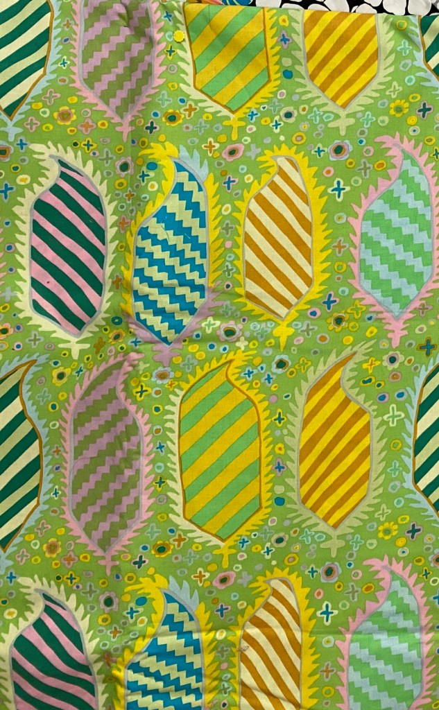
I just LOVE that fabric. I bought it on sale many years ago and I have wanted to use it as a backing but have never had a quilt that really worked with.
I’m really disappointed that is just doesn’t work with this quilt.
I’d like to thank the handful of very tasteful and adventurous people who said they like this option the best. And for those of you who boldly expressed things like “meh” and “just no!” I invite you to embrace your inner green! It’s the best color on earth!!!
As I saw all the comments coming in throughout the day I had a sense that one option was the run-way winner. But I decided I should actually count the votes and see where we ended up. Since some people were as indecisive as me, and consequently no help at all, the total votes don’t add up to the 127 comments.
Firmly in last place, to my grand disappointment, is the paler green that I had my heart set on. I LOOOOVE that fabric, but I agree that it’s not right for this quilt. This fabric garnered 9 “yes” votes. I’m not going to tell you how many “no” votes it got.
Second and third place are neck and neck. The option 1 red fabric got 23 votes and the option 3 green Antwerp flowers got 24 votes.


And the clear winner with 32 votes is option 4, the bright zig zag fabric.
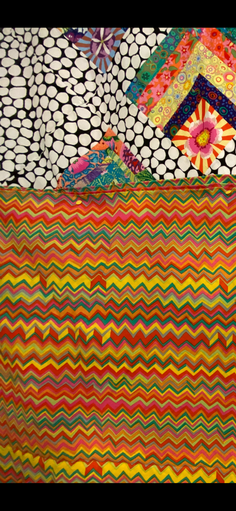
And after all that I’m laying on the sofa with my lap top on my lap and I’m laughing because I’m still as undecided as I was before all of this!!!
I think these options are fine. But not of them really grabs me.
So which one of these would I actually choose if someone forced me to? I’d probably have to go with the red option #1. But I can’t tell you that I love it.
A couple people were very certain that I should select something else. But I would really like to use something in my stash and these four were the best option. If I was going to BUY a backing fabric for this quilt, it wouldn’t be any of these options.
So now what?
I decided to look in a drawer in my sewing room that’s filled with pieces of fabric that are larger than my typical stash fabrics, but not large enough for a full backing.

I thought I might be able to find something that works, but might have to be combined with another strip of fabric to make it big enough.
I pulled out a few pieces that were definitely NO!
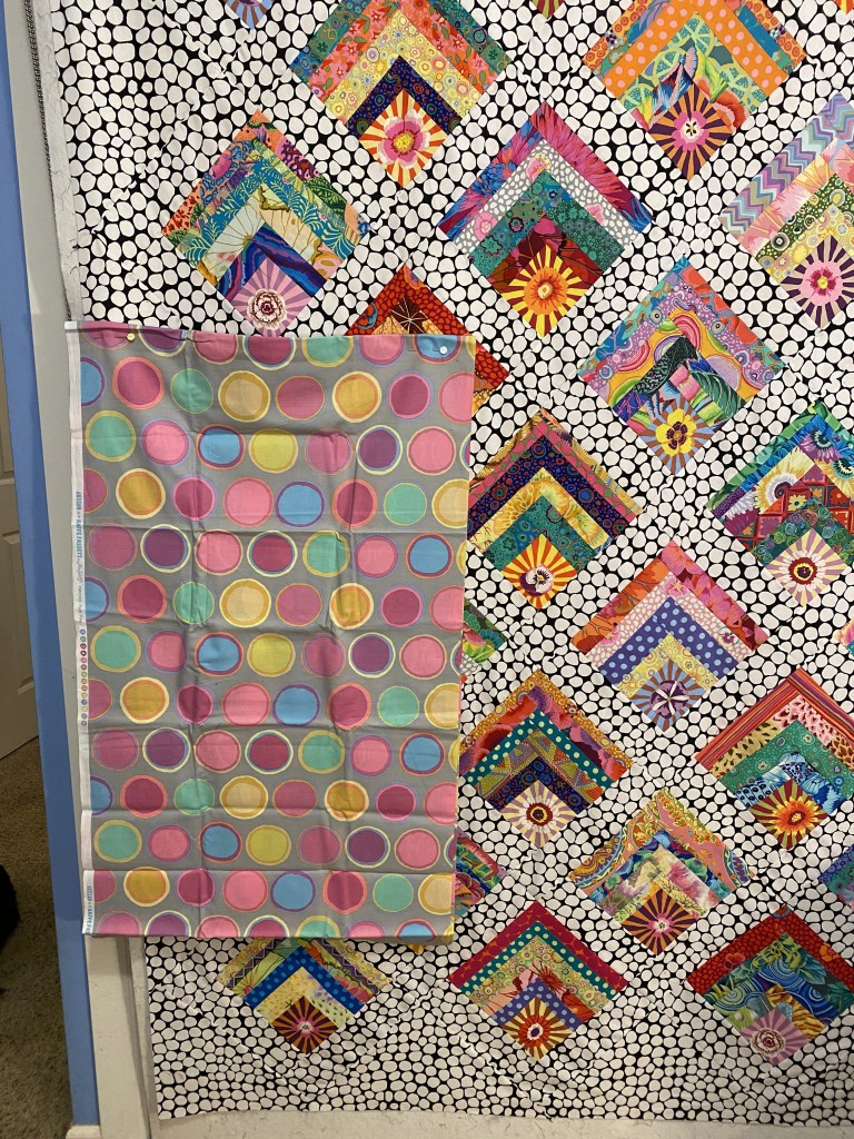

Yeah. Definitely YUCK.
But there are some options that are more interesting.
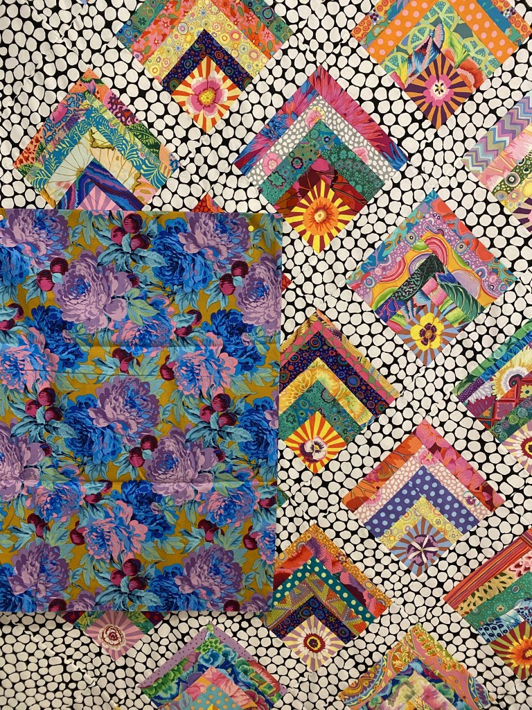

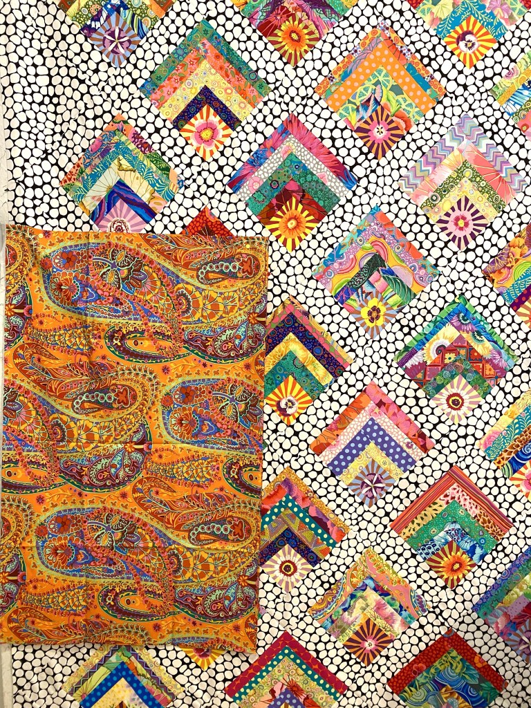
I’m not sure about the blue/purple one. There is just so little of those colors in the top. The middle one is very bright and cheery. The last one is a definite option for me and it’s one of my favorite Kaffe fabrics ever.
These last two are the most interesting to me. First, this gorgeous orchid print painted by Philip Jacobs. It’s such a beautiful fabric and I like it with this top, but it all feels a little to medium to me. I feel like the back of this quilt needs to be more saturated and deep in color.
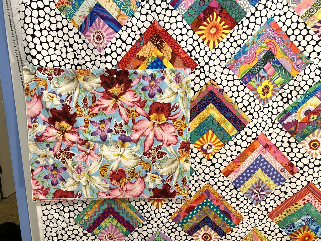
I have a couple pieces of this but would have to be combined with another fabric to make it large enough. There is a jumble that goes nicely with it that I could use.
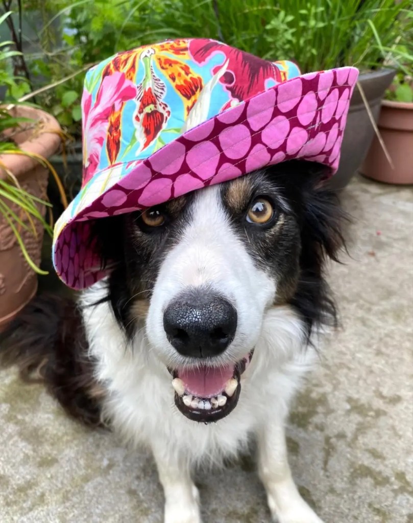
That photo gives you a better idea of the colors in that fabric. It also gives you an idea of how freaking cute Bender is!!!
The other option that I like will not make the green haters out there happy.

There’s not enough of that green to do the entire backing. It would be combined with some of the black and white jumble.
Well, I don’t have to make a decision tonight.
Thanks again to everyone who commented. If you haven’t yet, take a few minutes to read through the comments on last night’s post. You can find the comments by scrolling down on the page. It’s really interesting to see what different people saw in each option.
I usually reply to all comments on my blog posts, but I’m not going to be able to do that since there were so many!
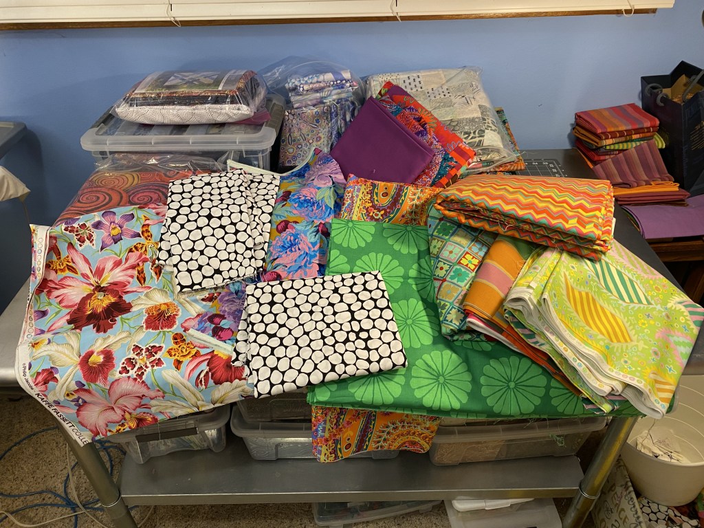
And I’ll close tonight with this photo illustrating what indecision looks like.
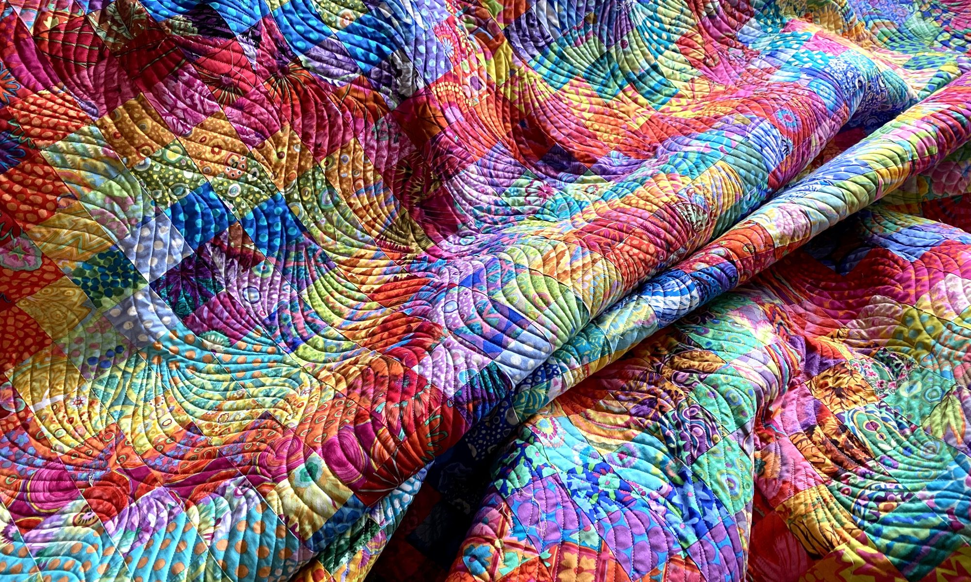
ok…You didn’t ask, but here goes:
the orange paisley Kaffe is better than the red !!! & Yes, Bender is dang cute in that hat;)
ardine
LikeLiked by 1 person
I really like the red with this quilt top, but not this red fabric. It needs something more fun and less serious.
Anne
LikeLike
Another thought …. Could you use the black and white as a border around each of the other pieces and join them together to make the backing… that way you can mix and match ❓ Again … just a thought 💭
LikeLiked by 1 person
Interesting idea, but I’m not into putting that much work into a backing! I really dislike making backings so want it to be quick and easy.
Anne
LikeLiked by 1 person
I like the yellow petunias as they complement the flowers and backgrounds on the quilt, are not overwhelmed by the black and white and finally, have energy!
LikeLiked by 2 people
I’m not sold on orange for this quilt top. Plus, I’ve already purchased a piece of fabric on sale online. Shhh.
Anne
LikeLike
Hello Anne – my favorite choice is the green/jumble combination!
LikeLiked by 1 person
[image: IMG_3347.jpeg]
You didn’t even discuss this yet! This is what I will use for the binding when I make mine…. KF White Guinea Flower
LikeLiked by 1 person
One of my favorite fabrics! But I’m thinking I’ll used Crease in black and white.
Anne
LikeLike
the yellow cheery one is the clear choice
LikeLiked by 1 person
I’m not crazy about the yellow with this top. I feel like it needs a saturated red or pink… something hotter than yellow.
Anne
LikeLike
I like the Orange paisley also! Too many possibilities don’t make the choice any easier.
LikeLiked by 1 person
I love that fabric but it feels a little flat with this quilt. Orange doesn’t feel right to me.
Anne
LikeLike
I like the zigzag the best of the choices although it sounds like you don’t. It might make a difference seeing it in person though. And Bender definitely is cute!
LikeLiked by 1 person
I don’t dislike it, I just don’t love it. It’s fine, but it’s not really great.
Anne
LikeLike
Love the photo of Bender! Seeing that pink jumble makes me wonder if you would consider using a colored jumble with a black and white graphic? I love the orchid fabric but think the graphic style doesn’t go well with the graphics of the front
Get Outlook for Androidhttps://aka.ms/AAb9ysg ________________________________
LikeLiked by 1 person
Jumble would make a great backing. But I already purchased something else on sale. Fingers crossed it works!
Anne
LikeLike
I like the blue/purple one because it is brighter and has all your colors in it.
LikeLiked by 1 person
I don’t mind it but I don’t love it. I LOVE the fabric, just not with this quilt top.
Anne
LikeLike
I’m happy to say the Orange paisley Kaffe fabric fits the bill ! It would make a lovely backing for your even lovelier quilt. Go for it!
<
div>Sheryl K
Sent from my iPad
<
div dir=”ltr”>
<
blockquote type=”cite”>
LikeLiked by 1 person
I actually have a large piece of that but it’s being saved for a specific quilt. Plus… I already bought something on sale yesterday! Shhh.
Anne
LikeLike
Love the Orange Paisley! Understand about trying to keep stash separate from assigned purpose. The ZigZag with the paisley binding could work nicely. I know you want to use the Herald Stripe but, I think it needs to be combined to give it a boost. Maybe combine with the Damask?
I don’t know who said backs were easy but they were wrong. Having more experience making quilt tops has made me very fussy with my backs. Even when I use stash, and have pieced them to use leftover blocks and pieces from the top, it has to be right. You spend so much blood, sweat, and swear words on getting the top right that the back just has sing.
LikeLiked by 1 person
I went online and bought some fabric on sale to use as a backing. None of what I had really worked for me. I think what I bought will be really fun and perfect! I hope so!!!
Anne
LikeLike
I am sure it will be! 😊
LikeLike